Sequencing Quality Control
Overview
Teaching: 60 min
Exercises: 90 minObjectives

Why do we perform read QC?
Nanopore sequencing produces long reads, but the reads are not all equally useful. Sequencing errors are particularly important, because they can affect the assembly and interpretation of viral genomes. For example,
many phages naturally have low-complexity regions in their genomes (e.g. ACACACACAC). Nanopore sequencing errors are biased towards these regions, either creating them falsely or exaggerating them, which can introduce artefacts into assembled viral genomes. For example, high-quality reads meaningfully improve assemblies.
Quality control helps us to answer two questions:
- How good is our sequencing data?
- Which reads should we keep for downstream analysis?
Several different processing steps are often described together as “read QC”, but they do different things:
- Demultiplexing assigns reads to the correct sample based on their barcode.
- Barcode removal removes artifical barcode sequences, i.e. oligonucleotides that were added to identify sequences from a particular sample.
- Adapter and primer removal removes artifical sequences added during library preparation and sequencing.
- Trimming removes low-quality nucleotides from the ends on individual reads: sequencing quality often drops towards the end of a read.
- Read filtering removes entire reads that do not meet specified criteria.
Exercise 1 - Why does read QC matter?
Discuss with your classmates and TAs:
- Imagine that some of your reads contain many sequencing errors or that adapters were not removed. How could this affect viral genome assembly? What other problems could this introduce?
- What characteristics could you use to decide whether a read is useful?
- What could be the advantages and disadvantages of removing low-quality reads?
Assessing read quality with NanoPlot
The first step in quality control is to inspect the data before deciding whether to filter it.
In this course, we will assess the quality of the reads and filter entire reads. We will not perform quality trimming: we have already performed demultiplexing, barcode removal, adapter/primer removal, and trimmed low-quality nucleotides (steps 1-4) using the Nanopore basecaller Dorado and Barbell. The resulting sequencing files are in data/sequences.
We’ll use NanoPlot, designed for long-read data, to examine the quality and length of our reads.
Recall from this morning that every base call in a FASTQ file has a Phred quality score, Q. It describes the probability that the base call is incorrect:
Q = -10 × log10(P_error)
For example:
| Phred score (Q) | Error probability | Base call accuracy |
|---|---|---|
| Q10 | 1 in 10 | 90% |
| Q20 | 1 in 100 | 99% |
| Q30 | 1 in 1,000 | 99.9% |
These are per-base quality scores: every nucleotide has its own score. NanoPlot reports a single per-read quality score which summarizes the quality of all bases in a read. Because Phred scores are logarithmic, this is not simply the arithmetic mean of individual Q scores (the per-base error probabilities are averaged first, and only then converted back into a Q score).
Running NanoPlot
Run the NanoPlot script found in
Viromics2026_workspace/1.1_QC/. This is a working script that runs NanoPlot on every.fastq.gzfile in./data/sequences/. If you want, inspect the script to see how it works. You can read the NanoPlot github page for more information about the tool. After submitting the job, check the.errand.outfiles to make sure it completed successfully.NanoPlot produces an HTML report per sample. You can open these directly in the VS Code editor if you install the
ms-vscode.live-serverextension in the extension tab. Install the extension, then open theNanoPlot-report.htmlby right clicking on the file and selecting Show Preview (double clicking will show the raw HTML file).
Interpreting NanoPlot output
This is an example of a plot you might get from NanoPlot. Looking at plots like this helps you estimate how much data you’d lose by filtering on read quality or length.
- The top plot shows the frequency of read lengths
- The large main plot shows how read quality changes with read length
- The right plot shows the frequency of read qualities
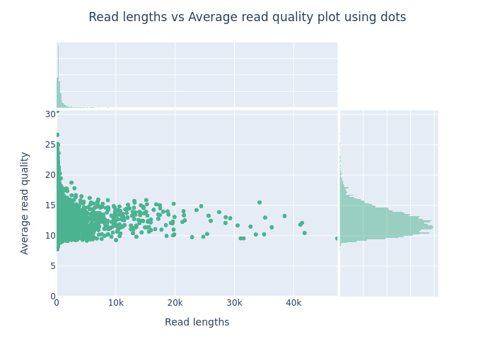
Open the NanoPlot report for your sample.
Exercise 2 — interpret your plots
- How does the sequencing quality of your virome compare with the example image above? Cite specific metrics from your own NanoPlot results.
- What is the mean read quality NanoPlot reports for your sample?
- Do we need to remove any reads from our data? Why (not)?
- How much data would be lost from each sample if we filtered at Q7? At Q12?
Choosing filtering parameters
There is no universal quality threshold that should always be used for Nanopore viromics data. A suitable threshold depends on:
- the quality of the sequencing run;
- the amount of sequencing data available;
- read lengths;
- the downstream analysis;
- computational resources.
For this course, we will use relatively strict filtering because we will assemble the reads tomorrow. Assembly is computationally expensive, and reducing the number of reads makes the exercise faster and more manageable.
Open the supplied Chopper sbatch script. Using the Chopper documentation as a reference, adapt the script so it retains reads with a quality score of at least 24, a minimum length of 1000 and a maximum length of 40000.
Save the script and submit the job.
Check the .err and .out files to see if it ran successfully.
Exercise 3 — filter your reads
- How many reads do you have left after filtering?
How many reads were removed? Run NanoPlot again on the filtered reads to visualise the difference in read statistics. To do this, you need to change the
datadirandoutdirvariables in the existing script.- What is the average read quality before and after filtering?
Optional Challenge: Exploring GC content
If you have time left after filtering your reads, here’s an optional way to explore your data further.
So far we’ve filtered on read quality and length. There’s another useful signal worth checking: GC content: (sum of G’s + C’s) / (sum of all bases). There’s no universally “correct” GC content. Instead, it tells you something about the nucleic acid composition of your sample.
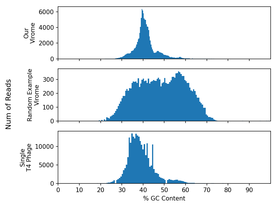
GC content is generally consistent along the length of a single genome. That means if you plot the GC content from reads coming from one genome in a histogram, you’d expect a unimodal distribution. Outlier regions within a genome (a horizontally transferred gene, an inserted prophage, a mobile genetic element) show up as reads that deviate from that peak.
Predicting the GC distribution of a virome
Before running the analysis discussion this question with a neighbour:
What do you expect the GC-content distribution of a virome to look like, compared to the GC-content distribution of a single genome?
Draw or describe your prediction and explain your reasoning.
Only after you made your prediction, use 1.1_40_gc_challenge.sbatch to plot the GC content of one of your fastq.gz files. You may need to update the read_path arguemnt to point to your fastq.gz file. The output should be in30_gc_content/gc_content.png. Use the VS Code Explorer to view your plot. If you want to make plots of multiple fastq.gz files, make sure not to override the output file :)
Questions
- Does your virome’s QC-content distribution match your prediction?
- Compare your plot with the example viromes and E. coli phage T4 genome provided below. Where does your sample fit?
- How would the GC content profile of a metagenome (bacteria and phages together) differ from a virome?
Resources
- Information about Nanopore sequencing quality and Phred scores
- How to write a for-loop to loop through your files
Key Points