Welcome
Overview
Teaching: 60 min
Exercises: 0 minQuestions
Who is sitting next to me?
What are we going to do in this workshop?
Objectives
Overall view of the workshop
Getting to know each other
Key Points
Listen to Assembly lecture
Overview
Teaching: 45 min
Exercises: 0 minQuestions
Objectives
Key Points
The dataset
Overview
Teaching: 15 min
Exercises: 5 minQuestions
What is metagenomics?
What do we call viral dark matter?
Where does the dataset come from?
What format is the sequencing data?
Objectives
Understanding what is a metagenomic study.
Understanding how the samples in the dataset are related.
Collecting basic statistics of the dataset.
Before anything else, download the file containing the conda environment file, create the environment in your machine, and activate it.
# download the file describing the conda environment
$ wget https://raw.githubusercontent.com/MGXlab/Viromics-Workshop-MGX/gh-pages/code/day1/day1_env_file.txt

# create the environment, call it day1_env
$ conda create --name day1_env --file day1_env_file.txt

# activate the environment
$ conda activate day1_env
Metagenomics
The emergence of Next Generation Sequencing (NGS) has facilitated the development of metagenomics. In metagenomic studies, DNA from all the organisms in a mixed sample is sequenced in a massively parallel way (or RNA in case of metatranscriptomics). The goal of these studies is usually to identify certain microbes in a sample, or to taxonomically or functionally characterize a microbial community. There are different ways to process and analyze metagenomes, such as the targeted amplification and sequencing of the 16S ribosomal RNA gene (amplicon sequencing, used for taxonomic profiling) or shotgun sequencing of the complete genomes in the sample.
After primary processing of the NGS data (which we will not perform in this exercise), a common approach is to compare the metagenomic sequencing reads to reference databases composed of genome sequences of known organisms. Sequence similarity indicates that the microbes in the sample are genomically related to the organisms in the database. By counting the sequencing reads that are related to certain taxa, or that encode certain functions, we can get an idea of the ecology and functioning of the sampled metagenome.
When the sample is composed mostly of viruses we talk of metaviromics. Viruses are the most abundant entities on earth and the majority of them are yet to be discovered. This means that the fraction of viruses that are described in the databases is a small representation of the actual viral diversity. Because of this, a high percentage of the sequencing data in metaviromic studies show no similarity with any sequence in the databases. We sometimes call this unknown, or at least uncharacterizable fraction as viral dark matter. As additional viruses are discovered and described and we expand our view of the Virosphere, we will increasingly be able to understand the role of viruses in microbial ecosystems.
Today we will re-analyze the metaviromic sequencing data from 2010 where the crAssphage, the most prevalent bacteriophage in humans, was described for the first time. It was named after the cross-assembly procedure employed in the analysis. Besides replicating the cross-assembly, today we will follow an alternative approach using state-of-the-art bioinformatic tools that will allow us to get the most out of the samples.
The dataset for the workshop
During this workshop you will re-analyze the metaviromic sequencing data from Reyes et al., 2010 where the crAssphage, the most prevalent bacteriophage among humans, was described for the first time.
In this study, shotgun sequencing was carried out in the 454 platform to produce unpaired (also called single-end) reads. Raw sequencing data is usually stored in FASTQ format, which contains the sequence itself and the quality of each base. Check out this video to get more insight into the sequencing process and the FASTQ format. To make things quicker, the data you are going to analyze today is in FASTA format, which does not contain any quality information. In the FASTA format we call header, identifier or just name to the line that precedes the nucleotide or aminoacid sequence. It always start with a > symbol and should be unique for each sequence.
Let’s get started by downloading and unzipping the file file with the sequencing data in a directory called 0_raw-data. After this, quickly inspect one of the samples so you can see how a FASTA file looks like.
# create the directory and move to it
$ mkdir 0_raw-data
$ cd 0_raw-data

# download and unzip
$ wget https://github.com/MGXlab/Viromics-Workshop-MGX/raw/gh-pages/data/day_1/Reyes_fasta.zip
$ unzip Reyes_fasta.zip

# show the first lines of a FASTA file
$ head F1M.fasta
You will use seqkit stats to know how the sequencing data looks like. It calculates basic statistics such as the number of reads or their length. Have a look at the seqkit stats help message with the -h option. Remember you can analyze all the samples altogether using the star wildcard (*) like this *.fasta, which literally means every file ended with ‘.fasta’ in the folder. Which are the samples with the maximum and minimum number of sequences? In overall, which are the mean, maximum and minimum lengths of the sequences?
# get basic statistics with seqkit
$ seqkit stats 0_raw-data/Reyes_fasta/*.fasta
Notice how the samples are named. Can you say if they are related in some way? Check the paper (Reyes et al Nature 2010) to find it out.
Key Points
Metagenomics is the culture-independent study of the collection of genomes from different microorganisms present in a complex sample.
We call dark matter to the sequences that don’t match to any other known sequence in the databases.
FASTA format does not contain sequencing quality information.
Next Generation Sequencing data is made of short sequences.
Metavirome assembly
Overview
Teaching: 20 min
Exercises: 40 minQuestions
What is a sequence assembly?
How is different a cross-assembly from a normal assembly?
Objectives
Run a cross-assembly with all the samples.
Assemble each sample separately and combine the results.
Assembly and cross-assembly
Sequence assembly is the reconstruction of long contiguous genomic sequences (called contigs or scaffolds) from short sequencing reads. Before 2014, a common approach in metagenomics was to compare the short sequencing reads to the genomes of known organisms in the database (and some studies today still take this approach). However, recall that most of the sequences of a metavirome are unknown, meaning that they yield no matches when are compared to the databases. Because of this, we need of database-independent approaches to describe new viral sequences. As bioinformatic tools improved, sequence assembly enabled recovery of longer sequences of the metagenomic datasets. Having a longer sequence means having more information to classify it, so using metagenome assembly helps to characterize complex communities such as the gut microbiome.
In this lesson you will assemble the metaviromes in two different ways.
Cross-Assembly
In a cross-assembly, multiple samples are combined and assembled together, allowing for the discovery of shared sequence elements between the samples. If a virus (or other sequence element) is present in several samples, its sequencing reads from the different samples will be assembled together in one contig. After this we can know which contigs are present in which sample by mapping the sequencing reads from each sample to the cross-assembly.
You will perform a cross-assembly as in Dutilh et al., 2014. For this, merge the sequencing reads from all the samples into one single file called all_samples.fasta. We will use the assembler program SPAdes (Bankevich et al., 2012), which is based on de Bruijn graph assembly from kmers and allows for uneven depths, making it suitable for metagenome assembly. As stated above, this cross-assembly will combine the metagenomic sequencing reads from all twelve viromes into contigs. Because of the data we have, we will run SPAdes with parameters --iontorrent and --only-assembler, and parameters -s and -o for the input and output. Look at the help message with spades.py -h to know more details about the parameters. Look at the questions below while the command is running (around 10 minutes).
# merge the sequences
$ cat *.fasta > all_samples.fasta

# create a folder for the output cross-assembly
$ mkdir -p 1_assemblies/cross_assembly

# complete the spades command and run it
$ spades.py -o 1_assemblies/cross_assembly ...
Ion Torrent is a sequencing platform, as well as 454, the platform used to sequence the data you are using. Note well we used --iontorrent parameter when running SPAdes. This is because there is not a parameter --454 to accommodate for the peculiarities of this platform, and the most similar is Ion Torrent. Specifically, both platforms are prone to errors in homopolymeric regions. Have a look at this video from minute 06:50, and explain what is an homopolymeric region, and how exactly the Ion Torrent and 454 platforms fail on them.
Regarding the --only-assembler parameter, we use it to avoid the read error correction step, where the assembler tries to correct single base errors in the reads by looking at the k-mer frequency and quality scores. Why are we skipping this step?
Separate assemblies
The second approach consists on performing separate assemblies for each sample and merging the resulting contigs at the end. Note well if a species is present in several samples, this final set will contain multiple contigs representing the same sequence, each of them coming from one sample. Because of this, we will further de-replicate the final contigs to get representative sequences.
If you wouldn’t know how to run the 12 assemblies sequentially with one command, check block below. Else, create a folder 1_assemblies/separate_assemblies and put each sample’s assembly there (ie. 1_assemblies/separate_assemblies/F1M). Use the same parameters as in the cross-assembly.
Process multiple samples sequentially
Sometimes you need to do the same analysis for different samples. For those cases, instead of waiting for one sample to finish to start off with the next one, you can set a command to process all of them sequentially.
First you need to define a variable (ie. SAMPLES) with the name of your samples. Then, you can use a
forloop to iterate the samples and repeat the analysis command, which is everything between;doand the;done. Note well the sample name is just the suffix of the input and output and you still need to add the proper directory and file extension.Let’s say you have sequencing reads in the files
sample1.fastq,sample2.fastqandsample3.fastq, each of them representing a sample. You want to align them to a given genome using bowtie2 and save the output toalignments/sample1_aligned.sam,alignments/sample2_aligned.samandalignments/sample3_aligned.sam. You could do this:# define a variable with the names of the samples export SAMPLES="sample1 sample2 sample3" # iterate the sample names in SAMPLES for sample in $SAMPLES; do bowtie2 -x genome_index -1 ${sample}.fastq -S alignments/${sample}_aligned.sam ; done
Once the assemblies had finished, you will combine their scaffolds in a single file.
The identifier of a contig/scaffold from SPAdes has the following format (from the SPAdes manual): >NODE_3_length_237403_cov_243.207, where 3 is the number of the contig/scaffold, 237403 is the sequence length in nucleotides and 243.207 is the k-mer coverage.
It might happen that 2 contigs from different samples’ assemblies have the same identifier, and
recall from earlier this morning that
So, just in case, we will add the sample identifier at the beginning of the scaffolds identifiers
to make sure they are different between samples. Use the Python script rename_scaffolds.py
for this, which will create a scaffolds_renamed.fasta file for each sample’s assembly. Then,
merge the results into 1_assemblies/separate_assemblies/all_samples_scaffolds.fasta.
# download the python script
$ wget https://raw.githubusercontent.com/MGXlab/Viromics-Workshop-MGX/gh-pages/code/day1/rename_scaffolds.py

# include sample name in scaffolds names
$ python rename_scaffolds.py -d 1_assemblies/separate_assemblies

# merge renamed scaffolds
$ cat 1_assemblies/separate_assemblies/*/scaffolds_renamed.fasta > 1_assemblies/separate_assemblies/all_samples_scaffolds.fasta
To de-replicate the scaffolds, you will cluster them at 95% Average Nucleotide Identify (ANI) over 85% of the length of the shorter sequence, cutoffs often used to cluster viral genomes at the species level. For further analysis, we will use the longest sequence of the cluster as a representative of it. Then, with this approach we are:
- Clustering complete viral genomes at the species level
- Clustering genome fragments along with very similar and longer sequences
Look at the CheckV website and follow the steps under Rapid genome clustering based on pairwise ANI section to perform this clustering.
# create a blast database with all the scaffolds
$ makeblastdb ...

# compare the scaffolds all vs all using blastn
$ blastn ...

# download anicalc.py and aniclust.py scripts
$ wget https://raw.githubusercontent.com/MGXlab/Viromics-Workshop-MGX/gh-pages/code/day1/anicalc.py
$ wget https://raw.githubusercontent.com/MGXlab/Viromics-Workshop-MGX/gh-pages/code/day1/aniclust.py

# calculate pairwise ANI
$ python anicalc.py ...

# cluster scaffolds at 95% ANI and 85% aligned fraction of the shorter
$ python aniclust.py -o 1_assemblies/separate_assemblies/my_clusters.tsv ...
The final output, called my_clusters.tsv, is a two-columns tabular file with the representative sequence of the cluster in the first column, and all the scaffolds that are part of the cluster in the second column. Using cut and its -f parameter to put all the representatives names in one file called my_clusters_representatives.txt. Then, use seqtk subseq to grab the sequences of the scaffolds listed in my_clusters_representatives.txt and save them to my_clusters_representatives.fasta.
# put the representatives names in 'my_clusters_representatives.txt'
$ cut ... > 1_assemblies/separate_assemblies/my_clusters_representatives.txt

# extract the representatives sequences using seqtk
$ seqtk subseq ... > 1_assemblies/separate_assemblies/my_clusters_representatives.fasta
Scaffolding in SPAdes
Previously this morning you saw how, using paired-end reads information, contigs can be merged in scaffolds. However, we have been using the scaffolds during this
lesson. Identify a scaffold with clear evidence of merged contigs, and explain how is that possible if we are using single-end reads.Solution
Not the solution, but a hint ;) check the SPAdes manual
Key Points
With sequence assembly we get longer, more meaningful genomic fragments from short sequencing reads.
In a cross-assembly, reads coming from the same species in different samples are merged into the same contig.
Lunch break
Overview
Teaching: 55 min
Exercises: 0 minQuestions
Objectives
Key Points
Visualizing the assembly graph
Overview
Teaching: 20 min
Exercises: 30 minQuestions
How the k-mer size contributes to the conectivity of the graph?
Are related species connected in the graph?
Objectives
Understanding how k-mer size affects the topology of the graph
Understanding how the presence of similar species in the sample affects the graph
Effect of k-mer size
The choice of the size of k-mer has a great impact on the final assembly. When running SPAdes, you might have noticed it doesn’t use a single k-mer size per assembly but rather a range of k-mer sizes (21, 33 and 55 in this case), where each subsequent graph is built on the previous one. This is what they call a multisized de Bruijn graph. which benefits from the high connectivity of small k-mer sizes and the simplicity of the large ones. From Bankevich et al., 2012, smaller values of k collapse more repeats together, making the graph more tangled. Larger values of k may fail to detect overlaps between reads, particularly in low coverage regions, making the graph more fragmented. […] Ideally, one should use smaller values of k in low-coverage regions (to reduce fragmentation) and larger values of k in high-coverage regions (to reduce repeat collapsing). The multisized de Bruijn graph allows us to vary k in this manner.
Recall that k-mer size indicates the amount of overlap (k-1) that is necessary to perform the junction in the de Bruijn graph. The longer the k-mer is, the longer stretch of correct nucleotides are necessary to perform such junction. Knowing this, which k-mer sizes (small or large) are more affected by sequencing errors? Explain why.
We will use the Bandage tool to visualize
the graph. In the releases section,
follow instructions to download the most appropriate version. If you are in attending
the workshop live, download Bandage_Ubuntu-x86-64_v0.9.0_AppImage.zip).
To run it, unzip the file, open a new terminal tab (Ctrl + Shift + t), activate the conda
environment for today, and call Bandage from the terminal like this:
# run Bandage
$ ./Bandage_Ubuntu-x86-64_v0.9.0.AppImage
In File > Load_graph, navigate to any of the per sample assemblies and load
assembly_graph.fastg for the k-mer size 21. Then click Draw graph to see the
graph. Note well this graph has been already compacted by collapsing those nodes
that form linear, unbranched paths (click any large node to see how its length is
way larger than 21, the k-mer size). Without closing the Bandage window, open a new
terminal tab and run Bandage again to load the graph for the k-mer size 55. Answer
questions below:
- Why do we expect the graph to be very tangled with small k-mer sizes such as the K21?
- K55 graph seems easier to traverse, but note well this graph has been constructed using information from previous k-mers too. Can you think of any disadvantage of using only a large k-mer size to construct the graph? Would you expect high or low connnectivity?
Effect of related species
Often in metagenomic samples, a number of strains for a given species are present, and this is particularly evident with viral communities that typically contain an abundance of haplotypes (or quasispecies). Because of the high amount of homologous regions between these strains, the assembly graph is complex as multiple genomes occupy much of the same kmer space. The convergence-divergence structure in the graph generated by these homologous regions make traversing the graph more complex, and mistakes at this point can lead to chimeric contigs containing sequence from more than one strain. Note well the convergence-divergence structure is also observed in horizontal gene transfer events between any species.
The crAssphage in the graph
From Dutil et al., 2014 we know that one the viruses in this dataset is the prototypical crAssphage (p-crAssphage). Moreover, by mapping the sequencing reads back to the cross-assembly they could see a small contig recruiting reads from all the samples, suggesting that the genome where this contig comes from was present in all the samples. Or maybe related genomes that share that genomic sequence.
Let’s identify the p-crAssphage in the cross-assembly graph using Bandage and Blast. Download the p-crassphage genome as follows:
# download p-crassphage genome
$ wget https://raw.githubusercontent.com/MGXlab/Viromics-Workshop-MGX/gh-pages/code/day1/crAssphage.fasta
Then, run Bandage and load the cross-assembly graph under 1_assemblies/cross_assembly/assembly_graph.fastg.
Then, click Create/view BLAST search and use crAssphage.fasta as query. Colored
nodes are the ones showing similarity to the p-crAssphage. In a new Bandage window,
repeat the Blast analysis with the sample F2T1, which was used in the original paper
to reconstruct the p-crassphage. Can you explain what you see? To corroborate
your answer, inspect the assembly_graph.fastg file of F2T1 to know which scaffold
is the p-crassphage. After this, note if it clustered with any other scaffolds from
different samples.
Key Points
Assessing assemblies quality
Overview
Teaching: 15 min
Exercises: 25 minQuestions
Which assembly contains longer contigs?
Which assembly best represents the raw data (sequencing reads)?
Objectives
Assemblies assessment
Now we will measure some basic aspects of the assemblies, such as the fragmentation degree and the percentage of the raw data they contain. Ideally, the assembly would contain a single and complete contig for each species in the sample, and would represent 100% of the sequencing reads.
Fragmentation
Use the QUAST program (Gurevich et al., 2013) to assess how fragmented are the assemblies. Have a look at the possible parameters with quast -h. You will need to run it two times, one per assembly, and save the results to different folders (ie. quast_crossassembly and quast_separate)
# create a folder for the assessment
$ mkdir 1_assemblies/assessment

# run quast two times, one per assembly
$ quast -o 1_assemblies/assessment/<OUTPUT_FOLDER> ...
Raw data representation
You can know the amount of raw data represented by the assemblies by mapping the reads back to them and quantifying the percentage or reads that could be aligned. For this, use the BWA (cite) and Samtools (cite) programs. BWA is a short-read aligner, while Samtools is a suite of programs intended to work with mapping results. Mapping step requires you to first index the assemblies with bwa index so BWA can quickly access them. After it, use bwa mem to align the sequences to the assemblies and save the results in a SAM format file (ie. crossassembly.sam and separate.sam). Then use samtools view to convert the SAM files to BAM format (ie. crossassembly.bam and separate.bam), which is the binary form of the SAM format. Once you have the BAM files, sort them with samtools sort (output could be crossassembly_sorted.bam and separate_sorted.bam). Last, index the sorted BAM files to allow for an efficient processing, and get basic stats of the mapping using samtools flagstats.
# index the assemblies
$ bwa index <ASSEMBLY_FASTA>

# map the reads to each assembly
$ bwa mem ... > 1_assemblies/assessment/<OUTPUT_SAM>

# convert SAM file to BAM file
$ samtools view ...

# sort the BAM file
$ samtools sort ...

# index the sorted BAM file
$ samtools index ...

# get mapping statistics
$ samtools flagstats ...
Compare both assemblies
So far you have calculated some metrics to assess the quality of the assemblies, but bare in mind there also exist also others we can check for this, such as the number of ORFs or the depth of coverage across the contigs. In the report generated by Quast, look at metrics regarding scaffolds length, such as the N50. Can you explain the difference between both assemblies? Regarding the raw data containment, how different are both assemblies? Which metric do you find more relevant for metagenomics? Can you think of other metric to assess the quality of an assembly?
Key Points
Binning contigs
Overview
Teaching: 15 min
Exercises: 60 minQuestions
How many bins do we obtain?
Objectives
One of the drawbacks of the assembly step is that the actual genomes in the sample are usually split across several contigs. This can be a problem for analyses that benefit from having as much complete as possible genomes, such as metabolic pathways reconstruction or gene sharing analyses (check this). With binning we try to put together in a ‘bin’ all the contigs that come from the same genome, so we can have a better representation of it.
As you know from Arisdakessian et al 2021, two features are used to bin contigs: nucleotide composition and depth of coverage. You will use the CoCoNet binning software to bin the set of representative scaffolds you got in the previous lesson. For the nucleotide composition, CoCoNet computes the frequency of the k-mers (k=4 by default) in the scaffolds, taking into account both strands. For the depth of coverage, it counts the number of reads aligning to each scaffold, which at the end is a representation of the relative abundace of that sequence in the sample. This means that for the latter we need to provied CoCoNet with the short-reads aligned to the scaffolds, just as you did in the previous lesson. This time however you are not aligning all the samples altogether as if they were only one, but separately, so you should end up with 12 sorted BAM files. You can use the trick you learned in the previous lesson to process multiple samples sequentially. Don’t forget to index your sorted BAM files at the end.
# map (separately) all the sample to representative set of scaffolds
$ for sample in F*.fasta; do ... ... ... ; done
Once you have your BAM files, install and run CoCoNet with default parameters, and save the
results in the 3_binning folder. It should take 5-10 minutes. Look at questions
below in the meantime.
# deactivate the conda environment before running coconet
$ conda deactivate

# install coconet
$ pip install --user coconet-binning

# Run coconet. Don't forget to include your username in the command.
$ /home/<USERNAME>/.local/bin/coconet run --output 3_binning ...
Binning parameters
CoCoNet incorporates the cutoffs
--min-ctg-len(minimum length of the contigs) and--min-prevalence(minimum number of samples containing a given contig). By default, the first is set to 2048 nucleotides and the second to 2 samples. How increasing or decreasing these parameters would affect the results?
Binning results should be under 3_binning/bins_0.8-0.3-0.4.csv. If you have a look
at this file with head, each of the lines contains the name of a contig together
with the bin identifier, which is a number. Use the script create_fasta_bins.py
to create separate FASTA files for each bin, and save the results in 3_binning/fasta_bins.
# activate the environment again
$ conda activate day1_env

# download the python script
$ wget https://raw.githubusercontent.com/MGXlab/Viromics-Workshop-MGX/gh-pages/code/day1/create_fasta_bins.py

# Have a look at options
$ python create_fasta_bins.py -h

# run the script to create the FASTA bins with the correct options
$ python create_fasta_bins.py -o 3_binning/fasta_bins ...
You will be using these bins for days 3 and 4, so don’t forget where they are!
Key Points
Setup and run DeepVirFinder
Overview
Teaching: 15 min
Exercises: 15 minQuestions
Why do we use different environments for different tools?
How do we run DeepVirFinder?
Objectives
Create a conda environment from a .yaml file
Download DeepVirFinder and start a run
Today you will use different virus discovery tools and do a basic comparison of their performance on the assemblies that you created yesterday. To do this, we will heavily rely on conda to keep our computer environments clean and functional (Anaconda on Wikipedia). Conda enables us to create multiple separate environments on our computer, where different programs can be installed without affecting our global virtual environment.
Why is this useful? Most of the time, tools rely on other programs to be able to run correctly - these programs are the tool’s dependencies. For example: you cannot run a tool that is coded in Python 3 on a machine that only has Python 2 installed (or no Python at all!).
So, why not just install everything into one big global environment that can run everything? We will focus on two reasons: compatibility and findability. The issue with findability is that sometimes, a tool will not “find” its dependency even though it is installed. To reuse the Python example: If you try to run a tool that requires Python 2, but your global environment’s default Python version is Python 3.7, then the tool will not run properly, even if Python 2 is technically installed. In that case, you would have to manually change the Python version anytime you decide to run a different tool, which is tedious and messy. The issue with compatibility is that some tools will just plain uninstall versions of programs or packages that are incompatible with them, and then reinstall the versions that work for them, thereby “breaking” another tool (this might or might not have happened during the preparation of this course ;) ). To summarize: keeping tools in separate conda environments will can save you a lot of pain.
First, download the conda environments for today from here and use the file deepvir.yaml to create the conda environment for DeepVirFinder (Ren et al. 2020; DeepVirFinder Github).
# create the directory for today's tools and results
$ mkdir tools
$ mkdir results

# download and unzip the conda environemnts
$ wget https://github.com/MGXlab/Viromics-Workshop-MGX/raw/gh-pages/data/day_2/day2_envs.tar.gz
$ tar zxvf day2_envs.tar.gz
$ cd envs

# create the conda environment dvf for DeepVirFinder from deepvir.yaml
$ conda env create -f deepvir.yaml
This will take a couple of minutes. In the meantime, you can open another terminal window and download the DeepVirFinder github repository that contains the scripts.
# download the DeepVirFinder Github Repository
$ cd ~/ViromicsCourse/day2/tools/
$ git clone https://github.com/jessieren/DeepVirFinder

# Copy yesterday's contigs from the results
$ cp /path/to/yesterdays/scaffolds.fasta ~/ViromicsCourse/day2/
The file dvf.py inside the folder tools/DeepVirFinder/ contains the code to run DeepVirFinder. Once the conda environment has been successfully created, run DeepVirFinder on the contigs you have assembled yesterday (use the scaffolds from the cross-assembly, not the pooled separate assemblies). We want to focus on the most reliable contigs and will therefore only input contigs that are over 300 nucleotides in length (DeepVirFinder actually has an option that makes it pass sequences below a certain length, but some of the other tools do not have that option).
# Find out until which line you have to truncate the file to only include contigs longer than 300nt
$ less -N scaffolds.fasta
# While reading the file with less, you can look for a pattern by typing
/_length_300_

# Make truncated contig file (replace xxx with the last line number you want to include - the sequence of the last contig longer than 200nt)
$ head -n xxx ~/ViromicsCourse/day2/scaffolds.fasta > ~/ViromicsCourse/day2/scaffolds_over_300.fasta

# Activate the deepvir conda environment
$ conda activate dvf

# Run DeepVirFinder
(dvf)$ python3 dvf.py -i ~/ViromicsCourse/day2/scaffolds_over_300.fasta -o ~/ViromicsCourse/day2/results/
DeepVirFinder will now start writing lines containing which part of the file it is processing.
While DeepVirFinder is running, listen to the lecture.
Key Points
Different tools have different environments. Keeping them in separate environments makes runs reproducible and prevents a variety of problems.
We are running DeepVirFinder during the lecture, because the run takes ~50 minutes.
Listen to Virus Detection lecture
Overview
Teaching: 60 min
Exercises: 0 minQuestions
Objectives
Listen to Tina’s lecture.
Listen to Tina’s lecture while DeepVirFinder is running.
Key Points
Setup and run PPR-Meta
Overview
Teaching: 10 min
Exercises: 20 minQuestions
How do we install and run PPR-Meta?
How are PPR-Meta and DeepVirFinder different?
Objectives
Create the PPR-Meta conda environment
Run PPR-Meta
In the lecture you have heard what different strategies tools can use to detect viral sequences from assembled metagenomes. The overall objective of today is to test how these different strategies affect which sequences are annotated as viral and which ones are not.
The second tool we are going to run is called PPR-Meta (Fang et al. 2019). Like DeepVirFinder, PPR-Meta uses deep learning neural networks to annotate sequences as bacterial, viral, or plasmid. Both PPR-Meta and DeepVirFinder initially encode DNA sequences the same way: as a list of binary vectors. This means that each nucleotide is encoted as a binary vector, for example: A=[1,0,0,0], C=[0,1,0,0], and so on. This type of recoding categorical data in a binary way is known as one hot encoding. In DeepVirFinder, this encoding is used to learn genomic patterns. In essence, DeepVirFinder learns how often certain DNA motifs appear in each sequence by “sliding” a 10-nucleotide window over the sequence. The window is then compared to known motifs pre-trained model to decide whether a sequence should be classified as bacterial or phage. PPR-Meta is a little simpler: The DNA is encoded in the manner mentioned above. Then, PPR-Meta does the same thing for codons - in this case, the binary vectors each have a length of 64, as there are 64 different possible codons. The two resulting matrices are the input for the prediction of phage/plasmid/microbial sequence.
Getting PPR-Meta to run is a little more work than DeepVirFinder. First, deactivate the dvf conda environment if you haven’t already.
# deactivate deepvir
(dvf)$ conda deactivate
$
Then, create a conda environment for pprmeta from the file pprmeta.yaml (If you cannot remember how to do this, look back to the previous lesson) and activate the new environment. Afterwards, you have to download the MATLAB Runtime from this website. Make sure that you download the linux version and specifically, version 9.4.
# unzip MCR
(pprmeta)$ unzip MCR_R2018a_glnxa64_installer.zip

# install MCR into the tools folder
(pprmeta)$ ./install -mode silent -agreeToLicense yes -destinationFolder ~/ViromicsCourse/day2/tools
The installation will take a little while. In the meantime, to better understand the differences between the tools, read the description of how they work in their publications.
PPR-Meta - Read at least the sections Dataset construction and Mathematical model of DNA sequences
DeepVirFinder - Read the sections DeepVirFinder: viral sequences prediction using convolutional neural networks, Determining the optimal model for DeepVirFinder, and the first two paragraphs of section Predicting viral sequences using convolutional neural networks (don’t worry about the math to much).
Next, download PPR-Meta and make the main script into an executable.
# download PPR-Meta
(pprmeta)$ git clone https://github.com/zhenchengfang/PPR-Meta.git
(pprmeta)$ cd PPR-Meta

# make main script into an executable
(pprmeta)$ chmod u+x ./PPR-Meta
Finally, we have to edit the so-called LD_LIBRARY_PATH, a variable that contains a list of filepaths. This list helps PPR-Meta to find the MCR files that it needs to run, as the program doesn’t “know” where MCR is installed. PPR-Meta provides a small sample dataset that you can test the installation on.
# Add MCR folders to LD_LIBRARY_PATH
# Note: If you have another version of MCR installed in your conda version, you might need to unset the library path first using: unset LD_LIBRARY_PATH
(pprmeta)$ export LD_LIBRARY_PATH=$LD_LIBRARY_PATH:~/ViromicsCourse/day2/tools/v94/runtime/glnxa64
(pprmeta)$ export LD_LIBRARY_PATH=$LD_LIBRARY_PATH:~/ViromicsCourse/day2/tools/v94/bin/glnxa64
(pprmeta)$ export LD_LIBRARY_PATH=$LD_LIBRARY_PATH:~/ViromicsCourse/day2/tools/v94/sys/os/glnxa64
(pprmeta)$ export LD_LIBRARY_PATH=$LD_LIBRARY_PATH:~/ViromicsCourse/day2/tools/v94/extern/bin/glnxa64

# You can test whether PPR-Meta is running correctly by running
(pprmeta)$ cd ~/ViromicsCourse/day2/tools/PPR-Meta
(pprmeta)$ ./PPR-Meta example.fna results.csv
If the test run finishes successfully, then you can run PPR-Meta on the truncated contig file.
# Run PPR-Meta on contigs
(pprmeta)$ ./PPR-Meta ../../scaffolds_over_300.fasta ../../results/scaffolds_over_300_pprmeta.csv
PPR-Meta is very fast - your run should only take a couple of minutes. When it’s finished, move on to the next section. If you don’t have the database for virsorter on your computer yet, you can start the download in the background now. You can download the data here and unzip it after the download.
Key Points
Setting up the right conda environment for a tool can be tricky.
PPR-Meta runs much faster than DeepVirFinder.
Setup and Run VirFinder
Overview
Teaching: 15 min
Exercises: 15 minQuestions
How do we run VirFinder and how is it different from the other tools?
Objectives
Setup and Run VirFinder
Before we start analyzing the results from DeepVirFinder and PPR-Meta, we will run a third tool: VirFinder (Ren et al. 2017). As you might be able to tell from the name, VirFinder is DeepVirFinder’s predecessor. VirFinder uses a different type of machine learning to identify viruses: logistic regression. Logistic regression is best used for qualitative prediction, that is, to decide which of two classes an object belongs to. VirFinder does this using kmer frequencies. So, VirFinder looks at each kmer of length 8 within each sequence and builds a matrix of which kmers were found and how frequently. Based on the comparison between this kmer matrix and the training data, VirFinder makes a prediction of whether a sequence belongs to a virus or a microbe.
Based on your experience so far, will this method be faster or slower than the tolls that you have run before?
To setup VirFinder, first create the conda environment from virfinder.yaml (don’t forget to deactivate the pprmeta environment if you are still using it).
If you had trouble running it before lunch, you can download the updated environment here
Then, within the virfinder environment run rstudio.
# Run rstudio GUI within the virfinder environment
$ rstudio
The next few commands will be in R.
# Attach the VirFinder package
> library("VirFinder")

# Run VirFinder on our dataset
> predVirFinder <- VF.pred('~/ViromicsCourse/day2/scaffolds_over_300.fasta')

# Save the resulting data frame as a comma-separated textfile
> write.csv(predResult, "~/ViromicsCourse/day2/results/scaffolds_over_300_virfinder.csv", row.names=F)
Discussion: Logistic Regression
Is VirFinder faster or slower than you predicted? What could be the reason for why it is so fast?
Where would you draw the decision boundrary?
Stay in RStudio for the next section.
Key Points
Logistic Regression is another type of Machine Learning than can be used to distinguish between viral and non-viral sequences
Comparing Virus Identification Tools
Overview
Teaching: 15 min
Exercises: 15 minQuestions
How can we compare the results of different virus identification tools?
Which tool finds more phages?
Why would the tools disagree?
Objectives
Read the results so far into data frames.
Find out how many viral sequences each tool has predicted.
Discuss how moving the decision boundrary in VirFinder and DeepVirFinder affects your result.
Before we run the final tool over lunch, we will shortly inspect the results of the three tools we have run so far. The following steps are marked as challenges, so that you can try for yourself if you already have experience with R. If you do not have experience with R or you don’t have a lot of time before lunch, feel free to use the solution to continue.
The results of VirFinder should already be in your R workspace in a dataframe called predVirFinder. If you have closed RStudio after the last section, load the VirFinder results into R from the csv file that you have created in the last section, the same way as the others.
Challenge: Loading the results of DeepVirFinder and PPR-Meta into R
You have successfully run two tools apart from VirFinder, which have produced a comma-separated file (DeepVirFinder) and a tab-separated file (PPR-Meta). Load them into your R workspace.
Hint: Make sure your working directory is set correctly
Solution
# Load DeepVirFinder results
> predDeepVir <- read.csv('~/ViromicsCourse/day2/results/scaffolds_over_300_deepvirfinder.csv')

# Load PPR-Meta results
> predPPRmeta <- read.table('~/ViromicsCourse/day2/results/scaffolds_over_300_pprmeta.txt', header=T)
Discussion: Comparing Tools
Look at the three data frames you have created. What kind of information can you find in there? Is it clear to you what each of the values mean?
Think of ways to compare the results of the three tools. How would you decide which of these three tools is best suited for your research?
Challenge: Counting phage annotations
One way to compare tools would be to compare how many sequences are annotated as phages. Do that for DeepVirFinder, PPR-Meta, and VirFinder. Given what you know about the dataset: How many sequences do you expect to be viral? How many of the scaffolds are annotated as viral by each tool?
Solution
For PPR-Meta, counting the number of sequences annotated as phages is the most straightforward.
# Sum up all the rows that are annotated as a phage
> sum(predPPRmeta$Possible_source =='phage')
For VirFinder and DeepVirFinder, counting the number of sequences annotated as phages is more complicated. The simplest way would be to count how many sequences have a score above 0.5.
# Sum up all the rows that have a score above 0.5
> sum(predDeepVirFinder$score > 0.5)

> sum(predVirFinder$score > 0.5)
However, you might have seen that there is also a p-value available for the VirFinder and DeepVirFinder results. You might want to use them instead to decide whether you test your prediction.
# Sum up all the rows that have a p-value of max 0.05
> sum(predDeepVirFinder$pvalue <= 0.05)

> sum(predVirFinder$pvalue <= 0.05)


# Or, you might want to be even stricter and count only sequences with a p-value of max 0.01
> sum(predDeepVirFinder$pvalue <= 0.01)

> sum(predVirFinder$pvalue <= 0.01)
Discussion: Decision boundraries
With VirFinder and DeepVirFinder, you have seen that the decision boundrary is somewhat up to the user. How will moving the decision boundrary “up” (i.e. making it stricter) or “down” affect the results?
If instead of a viromic dataset you were looking at a gut microbiome dataset, how would that affect your choice for the decision boundrary?
Can you already tell which of these three tools is the best?
Key Points
Despite out data being almost exclusively viral, the tools identify max. 2/3 of the sequences as viral.
Making the decision boundrary less strict will include more sequences, which might seem like an advantage in this case. However, if we were working with a mixed metagenomic dataset, this would mean that we would falsely annotate microbial sequences as viral.
Setup and run VirSorter
Overview
Teaching: 10 min
Exercises: 20 minQuestions
How do we install and run VirSorter?
How is VirSorter different than the previous tools?
Objectives
Install and run VirSorter
The last virus identification tool, which we will run over lunch, is called VirSorter (Roux et al. 2015). VirSorter is different from the other tools in that it actually considers homology in predicting whether a contig belongs to a phage or a microbe. VirSorter distinguishes between “primary” and “secondary” metrics when deciding how to annotate a sequence. Primary metrics are the presence of viral hallmark genes an their homologs, and the enrichment of known viral genes. Secondary metrics include an enrichment in uncharacterized genes, depletion of PFAM-affiliated genes, and two metrics of genome structure.
Challenge: Viral genome structure
VirSorter uses two genome structure metrics to distinguish phage sequences from bacterial sequences. Can you think of viral genome structure metrics that could be useful for prediction?
Solution
VirFinder uses:
- an enrichment of short genes
- depletion in strand switch
To run VirSorter, first create the necessary environment from virsorter.yaml and activate it. Then, download virsorter into the day2/tools folder. Note that the following code is in bash again.
# Install Virsorter
$ cd ~/ViromicsCourse/day2/tools
$ git clone https://github.com/simroux/VirSorter.git
$ cd VirSorter/Scripts
$ make clean
$ make

# Make symbolic link of executable scripts in the environment's bin
# It is important to use the absolute path and not the relative path to the Scripts folder (replace XXX with the number of your account, or replace the absolute path with the path to your own anaconda if you join online)
$ ln -s ~/ViromicsCourse/day2/tools/VirSorter/wrapper_phage_contigs_sorter_iPlant.pl /mnt/local/prakXXX/anaconda3/envs/virsorter/bin
$ ln -s ~/ViromicsCourse/day2/tools/VirSorter/Scripts /mnt/local/prakXXX/anaconda3/envs/virsorter/bin
Finally, install metagene_annotator into the conda environment.
# Install metagene_annotator
$ conda install metagene_annotator -c bioconda
Finally, run VirSorter. Note that VirSorter is very particular about its working directory. It is best if it doesn’t exist beforehand (VirSorter will create it). If a run fails, then completely remove the working directory before you restart it.
# Run VirSorter
# Under the argument --data-dir put the link https://blahblah.com/virsorter-data
$ wrapper_phage_contigs_sorter_iPlant.pl -f ~/ViromicsCourse/day2/scaffolds_over_300.fasta --db 1 --wdir ~/ViromicsCourse/day2/results/virsorter --ncpu 1 --data-dir ~/ViromicsCourse/day2/tools/virsorter-data
If your run fails because “Step 1 failed”, then check the error file in ~/ViromicsCourse/day2/results/virsorter/logs/. If the error is “Can’t locate Bio/Seq.pm in @inc (you may need to install the Bio::Seq module)…”, then you need to copy a perl folder in the virsorter environment folder.
# Error fix for Can't locate Bio/Seq.pm in @inc
$ cd /mnt/local/prakXXX/anaconda3/envs/virsorter/lib/
$ cp -r perl5/site_perl/5.22.0/Bio/ site_perl/5.26.2/x86_64-linux-thread-multi/
Then try to run the command again. If you have more problems, let us know. Guten Appetit! Eet smakkelijk! Have a good lunch!
Key Points
VirSorter is a homology-based tool.
Because Virsorter has to compare each sequence to a database, it is slower that many other tools.
Lunch Break
Overview
Teaching: 50 min
Exercises: 0 minQuestions
What is the tastiest food we can find in the vicinity?
Objectives
Find the tastiest food in the vicinity.
Take a Lunch break of ~45 minutes.
Key Points
Nutrition is important
Guten Appetit!
Compare Results for four tools
Overview
Teaching: 60 min
Exercises: 60 minQuestions
How different are the predictions of the tools per contig?
How sensitive are the different tools we used?
Objectives
Assess whether the tools agree or disagree on which contigs are viral.
Compare the sensitivity of virus detection for the four tools.
Find out which tools make the most similar predictions.
Now that VirSorter has finished, take a look at the results (the main results file is called VIRSorter_global-phage-signal.csv. What kind of information can you find there?
If you couldn’t run VirSorter because of time or because you couldn’t download the database, you can downoad the virsorter results from here and unzip it using tar -xzvf.
Because the output of VirSorter looks a lot different compared to the output of the other tools, we will first reformat it into a similar file. Download the script reformat_virsorter_result.py from here. This script will read in the VirSorter results, add the contigs that were not predicted as phages, and add an arbitrary score to each prediction. A phage annotation that was predicted as “sure” (categories 1 and 4) gets a score of 1.0, a “somewhat sure” (categories 2 and 5) prediction gets a score of 0.7, and a “not so sure” (categories 3 and 6) prediction gets a score of 0.51. All other sequences get a score of 0.
Do you think these score represent the predictions well? Why (not)?
This script is used in the format:
# Format the virsorter result
$ python3 reformat_virsorter_result.py /path/to/virsorter_result_file.csv /path/to/output/file.csv

# This only works if the VirSorter result file is in its original place in the virsorter-results folder
# If you run the script from within the virsorter-results folder, give the filepath as ./VIRSorter_global-phage-signal.csv
You can now read the new csv file into R, e.g. as predVirSorter.
Count how many contigs are predicted to be phages (If you have trouble with this, look back to section 2.5). Can you explain the difference in numbers?
Now, let’s compare all the tools directly to each other. Again, all the exercises will be marked as challenges so that you can figure out the code for yourself or use the code we provide.
Challenge: Creating a dataframe of all results
First, create a data frame that is comprised of the contigs as rows (not as rownames though), and contains a column for each tool. Create a data frame that contains 1 if a sequence is annotated as phage by a tool and 0 if not. For VirFinder and DeepVirFinder, use a score of >0.5 as decision boundrary.
Solution
# Create the data frame and rename the column for the contig names
> pred<-data.frame(predDeepVirFinder$name)
> names(pred)[names(pred) == "predDeepVirFinder.name"] <- "name"

# Add the PPR-Meta results
> pred$pprmeta<-predPPRmeta$Possible_source

# Change the values in the pprmeta column so that phage means 1 and not a phage means 0
> pred$pprmeta[pred$pprmeta =='phage'] <- 1
> pred$pprmeta[pred$pprmeta !=1] <- 0

# Add the DeepVirFinder and VirFinder Results
> pred$virfinder<-predVirFinder$score
> pred$virfinder[pred$virfinder >=0.5] <- 1
> pred$virfinder[pred$virfinder  <0.5] <- 0

> pred$deepvirfinder<-predDeepVirFinder$score
> pred$deepvirfinder[pred$deepvirfinder >=0.5] <- 1
> pred$deepvirfinder[pred$deepvirfinder  <0.5] <- 0
# Add the VirSorter results
> pred$virsorter<-predVirSorter$pred
We have seen that some tools annotate more contigs as viral than others. However, that doesn’t automatically mean that the contigs that are annotated as viral are the same. In the next step, we will see whether the tools tend to agree on which sequences are viral and which aren’t.
Challenge: Visualize the consensus of the tools
From the data frame, create a heatmap. Since there are thousands of contigs in the data frame, we cannot visualize them all together. Therefore, make at least three different heatmaps of 50 contigs each, choosing the contigs you want to compare. How do you expect, the comparison will vary?
Solution
# Select three ranges of 50 contigs each
> pred.long<-pred[1:50,]
> pred.medium<-pred[2500:2550,]
> pred.short<-pred[8725:8775,]

# Attach the packages necessary for plotting and prepare the data
> library(ggplot2)
> library(reshape2)
> pred.l.melt<-melt(pred.long, id="name")
> pred.m.melt<-melt(pred.medium, id="name")
> pred.s.melt<-melt(pred.short, id="name")

# Plot the three heatmaps, save, and compare
> ggplot(pred.l.melt, aes(variable, name, fill=value))+geom_tile()
> ggsave('~/ViromicsCourse/day2/results/contigs_large_binary.png', height=7, width=6)

> ggplot(pred.m.melt, aes(variable, name, fill=value))+geom_tile()
> ggsave('~/ViromicsCourse/day2/results/contigs_medium_binary.png', height=7, width=6)

> ggplot(pred.s.melt, aes(variable, name, fill=value))+geom_tile()
> ggsave('~/ViromicsCourse/day2/results/contigs_short_binary.png', height=7, width=6)
Discussion: Consensus
Do the tools mostly agree on which sequences are viral?
How would you explain that?
Is the degree of consensus the same across different contig lengths?
What is your expectation about the scores for the contigs where the tools agree/disagree?
In the next step, do the same as before, but now instead of using a binary measure (each sequence either is annotated as viral or not), use a continuous measure, such as the score. Make sure to use the same rows as before.
Challenge: Visualize the difference in scores
As in the challenge above, create a data frame with a column that contains contig ids and a column per tool. This time, use the continuous score as measure.
Solution
# Create the data frame of prediction scores
> predScores<-pred
> predScores$deepvirfinder<-predDeepVirFinder$score
> predScores$virfinder<-predVirFinder$score
> predScores$pprmeta<-predPPRmeta$phage_score
> predScores$virsorter<-predVirSorter$score

# Select three ranges of 50 contigs each
> predScores.long<-predScores[1:50,]
> predScores.medium<-predScores[2500:2550,]
> predScores.short<-predScores[8725:8775,]

# Prepare the data for plotting
> predScores.l.melt<-melt(predScores.long, id="name")
> predScores.m.melt<-melt(predScores.medium, id="name")
> predScores.s.melt<-melt(predScores.short, id="name")

# Plot the three heatmaps, save, and compare
# The color palette in scale_viridis_c is optional. Scale_viridis_c is a continuous colour scale that works well for distinguishing colours
# If you prefer a binned colour scale, you can also consider using scale_viridis_b
> ggplot(predScores.l.melt, aes(variable, name, fill=value))+geom_tile()+scale_viridis_c()
> ggsave('~/ViromicsCourse/day2/results/contigs_large_continuous.png', height=7, width=6)

> ggplot(predScores.m.melt, aes(variable, name, fill=value))+geom_tile()+scale_viridis_c()
> ggsave('~/ViromicsCourse/day2/results/contigs_medium_continuous.png', height=7, width=6)

> ggplot(predScores.s.melt, aes(variable, name, fill=value))+geom_tile()+scale_viridis_c()
> ggsave('~/ViromicsCourse/day2/results/contigs_short_continuous.png', height=7, width=6)
Discussion: Differences in Score
Compare the heatmaps of continuous scores to the binary ones. Focus on the contigs for which the tools disagree. Are the scores more ambiguous for these contigs?
Pick out 1-5 contigs that you find interesting based on the tool predictions. Grab their sequences from the contig fasta file and go to the BLAST website. Pick out one or two BLAST flavours that you deem appropriate and BLAST the interesting contigs. If you have questions about running BLAST, don’t hesitate to ask one of us. What kind of organisms do you find in your hits?
We might also want to take a look at which tools make the most similar predictions. For this, we will make a distance matrix and a correlation matrix.
Challenge: Distance and Correlation Matrices
Find out which tools make the most similar predictions by making a euclidean distance matrix and a preason correlation matrix for all four tools.
Hint Don’t forget to exclude the first column from the distance and correlation functions.
Solution
# Make a euclidean distance matrix for binary annotation
> pred.t <- t(pred[,2:5])
> dist.binary<-dist(pred.t, method="euclidean")

# Make a euclidean distance matrix for continuous annotation
> predScores.t <- t(predScores[,2:5])
> dist.cont<-dist(predScores.t, method="euclidean")

# Make a correlation matrix for continuous annotation
> dist.corr<-as.dist(cor(predScores[,2:5], method='pearson'))
Finally, let us calculate, for each tool, the sensitivity metric. Sensitivity is a measure for how many of the viral sequences are detected compared to how many viral sequences are in the dataset. So, if True Positives (TP) are correctly annotated viral sequences, and False Negatives (FN) are viral sequences that were not detected by a tool, then: Sensitivity= TP/(TP+FN)
Challenge: Sensitivity
Calculate the sensitivity for each tool. Since we are working with a viromics dataset, you can assume all sequences are viral.
Hint For VirFinder and DeepVirFinder, use a score of >0.5.
Solution
# PPR-Meta
> number_of_detected_contigs/number_of_contigs


# VirFinder
> number_of_detected_contigs/number_of_contigs


# DeepVirFinder
> number_of_detected_contigs/number_of_contigs


# VirSorter: number of sequences annotated as viral
> sum(predVirSorter$pred==1)

> sum(predVirSorter$pred==1)/number_of_contigs
If you have some extra time before our shared discussion, you can make some additional heatmaps for different ranges of contigs. You can also try and see how the correlation matrix changes when you include only longer/shorter contigs.
For the second part of this section, we will have a shared discussion about our research projects and how to choose the right tool for our purposes.
Key Points
The different tools often agree, but often disagree on whether a contig is viral. This is to an extent affected by the length of the contig.
Even for current state-of-the-art tools, getting a high sensitivity is hard.
Some tools make more similar predictions than others.
Prophage Prediction
Overview
Teaching: 20 min
Exercises: 20 minQuestions
How is prophage prediction similar/different from free virus prediction?
How do I find detailed information about my results in several output folders?
Objectives
Find out how tools detect prophages in a contig and how they indentify the phage-host boundraries.
Go through the VirSorter results and find out all the information you can get about a single prophage.
Identifying viral sequences from assembled metagenomes is not limited to entirely viral or entirely microbial sequences. Another important identification use case is detecting prophages. In fact, tools for detecting prophages were some of the first virus identification tools.
Discussion: Detecting prophages
Can you think of reasons why prophages might be easier to detect than free phages?
Look back at the evidence that VirSorter uses to determine whether a contig is viral or not. Which of these types of evidence are also suitable to identify prophages?
After you have though about why prophages might be easier to detect that free phages, read the section “Identification of virus-host boundraries” in this paper. The paper is about a tool called checkV that you will hear more about on Thursday. It estimates completeness and contamination of a viral genome, and it also predicts the boundraries between prophage and host genomes.
Challenge: Prophage annotation
As you have seen in the file VIRSorter_global-phage-signal.csv, VirSorter doesn’t just determine which contigs are viral, it also detects prophages. Go back to the file and look at the detected prophages (categories 4, 5, and 6). Can you find out whether they are complete or partial prophages? Or where the boundraries are?
Solution
Let’s look at category 4 (sure). We will focus on the first 6 columns of this section, for which the headers are:
“Contig_id, Nb genes contigs, Fragment, Nb genes,Category, Nb phage hallmark genes, Phage gene enrichment sig”
The corresponding values for the first contig are:
Contig_id: VIRSorter_NODE_50_length_17040_cov_25_975213
Nb genes contigs: 19
Fragment: VIRSorter_NODE_50_length_17040_cov_25_975213-gene_4-gene_16
Nb genes: 13
Category: 1
Nb phage hallmark genes: 2
Phage gene enrichment sig: gene_4-gene_16:2.21652167838327
So, we can see that genes 4-16 show phage gene enrichment and are predicted to be from a prophage. since we know that there are 19 genes that are classified “Nb” (Non-bacterial), we can assume that this phage is complete.
Next, try to find out, where the host-phage boundrary is in terms of nucleiotide position. This information is not available from VIRSorter_global-phage-signal.csv, so try to find it in the rest of the results. Are all the genes encoded on the same strand? How many nucleotides are between the genes?
Solution
This is a little bit complicated. Sometimes we have to dig to get the information that we want. As you have seen, for contig 50, the prophage is predicted to range from gene 4 to gene 16. In the folder “Metric_files”, there is a file which contains the coordinates of each gene on the contig. VirSorter recommends to use the coordinates for all the genes plus 50 nucleotides upstream of the most 3’ gene and 50 nucleotides downstream of the most 5’ gene. In the case of contig NODE_50, this means that the prophage coordinates would be 1014-15338.
Out of the 13 genes, in this region, there is only one gene on the “+”-strand, while twelve others are on the “-“-strand.
The intergenic spaces between the genes are very short, sometimes they even overlap. If you compare the length of the intergenic regions of the predicted prophage to the lenght of the intergenic regions outside of the predicted prophage, you will see that they are very similar. This is probably due to the fact that our dataset is a virome and so we expect almost all of our contigs to be viral and have short intergenic regions.
Now, let’s see if we can identify the taxonomy of the prophages that VirSorter predicted. Let’s try it with a simple BLAST search. In the folder Predicted_viral_sequences, you will find fasta files (.fasta) and genbank files (.gb) for each category of phage. The prophages are located in the files for categories 4-6. Run a Megablast (other flavours will overload the BLAST server for contigs of this length) for each category. Do you expect to find results?
Discussion
Do you think that a BLAST search is the best way to assign taxonomy to viruses? How many viruses do you think you can annotate this way?
Do you have an idea for other ways to assign taxonomy to viruses?
Today, you have learned a few methods for how bioinformatic tools distinguish between viral and non-viral sequences, even if the sequences are not similar to any known viruses. You have seen that homology-based methods are less sensitive than feature-based methods supported by machine learning. You have discussed the applications for more senstitive and less sensitive tools depending on the experiment that is conducted. And you have seen that even the best current tools will sometimes disagree on which sequences are viral and which aren’t.
We hope that the insights from today will help you understand the advantages and limitations of using different tools and will help you in choosing the right tool for your puropose in your own research.
Now, the last part of today is to listen to Lingyi’s lecture about the benchmarking of virus identification tools.
Key Points
Features such as GC-Content changes, or sudden enrichment in viral genes indicate the presence of a prophage in a contig/genome.
Results of a tool are sometimes distributed across multiple folders. Make sure to check all output files so that you can get the max out of your experiment.
Listen to Benchmarking lecture
Overview
Teaching: 60 min
Exercises: 0 minQuestions
Objectives
Listen to Lingyi’s lecture
Listen to Lingyi’s lecture about her benchmark of different virus identification tools.
Key Points
Introduction and setting up
Overview
Teaching: 15 min
Exercises: 0 minQuestions
Objectives
Function annotation
When studying microorganisms we are often interested in what they do, how they do that, and how this relates to what we already know. In this part of the course we will work our way from DNA sequences to proteins with functional annotations. To do so we will first predict genes using Prodigal, and then assign functions by comparing the sequences to the PHROG database.
Fist create a directory in your home directory called day3 (mkdir day3). We will work in this directory for the rest of the day.
Setting up
First we will create a new folder in the home directory, mkdir day3, in which we will work for the rest of this day.
We will look in detail at several bins and annotations today and to make the steps below comparable it is important that all of our bins and contigs have the same naming. While everyone should have the same data the naming might not be the same for everyone due to stochasticity in the tools (for example it might be bin1 for someone whereas the same data is in bin2 for someone else).
Data
I concatenated all the bin sequences (in all_binned_contigs.fasta) that we will download from Github (see below).
Make sure we are in ~/day3/ (cd day3) then run the code below
mkdir fasta_bins
cd fasta_bins
wget https://github.com/rickbeeloo/day3-data/raw/main/all_binned_contigs.fasta
wget https://raw.githubusercontent.com/rickbeeloo/day3-data/main/bin_01.fasta
wget https://raw.githubusercontent.com/rickbeeloo/day3-data/main/bin_62.fasta
cd ..
Conda
Like you did before we have to activate a conda environment
wget https://raw.githubusercontent.com/rickbeeloo/day3-data/main/day3_func.yaml
conda env create -f day3.yaml -n day3
conda activate day3
Rstudio
While a lot of packages are available on conda not all of them are. In this case we have to install two packages “manually”. Open rstudio (type rstudio on the command line) and then in the console (bottom of the screen) first type:
install.packages("bioseq")
then
install.packages("insect")
The installation might take a couple of minutes so in the meantime open a new terminal, activate the same environment (conda activate day3) and continue with the next exercise
Key Points
Gene prediction
Overview
Teaching: 30 min
Exercises: 15 minQuestions
Objectives
We will use Prodigal , a tool for “prokaryotic gene recognition and translation initiation site identification”, to identiy putative protein coding genes in our phage contigs. I purposely quoted the title as this hints that the tool is not specificallly built for phage gene predcition but for prokaryotes instead.
Why would Prodigal still perform well for phages?
For prodigal to be able to predict genes it has to be trained, for which it uses several sequence charcteristics, among others:
- Start codon usage (ATG, GTG, TTG)
- Ribosomal binding site (RBS) motif usage
- GC bias
- hexamer coding statistics
Prodigal algorithm
Have a look at the 2010 paper for a more detailed explanation of the algorithm.
- What does prodigal do when there is no so called “Shine Dalgarno” motif?
- Why is verifying the predictions difficult?
- What start codon(s) does prodigal use in its search?
Now we have a rough idea of how Prodigal works, go to the “metagenomes” section in the prodigal wiki
- What would be the best approach for our dataset?
Contigs length
The manual states: Isolated, short sequences (<100kbp) such as plasmids, phages, and viruses should generally be analyzed using Anonymous Mode. As a note, “Anonymous mode” was previously called “meta” mode. Are our phages shorter than 100kb? how long is the longest contig? Use
bioawkto find that out.Solution
bioawk -c fastx '{ print $name, length($seq) }' fasta_bins/all_binned_contigs.fasta
Running Prodigal
Lets run -p meta on all our contigs. Make sure we are in the day3 folder, then run the code below
mkdir prodigal_default
cd prodigal_default
prodigal -i ../fasta_bins/all_binned_contigs.fasta -a proteins.faa -o genes.txt -f sco -p meta
cd ..
- How many proteins did we predict? (use
grepfor example)- That we did not predict proteins does not mean they are not there. In what case do you think prodigal will miss proteins?
Key Points
Prodigal modes
Overview
Teaching: 30 min
Exercises: 30 minQuestions
The manual does state that normal mode would be preferable, as it will train the model for the sequence in question, however this would generally require >100kb sequence to obtain sufficient training data. As we can see from the previous step we do not have one that satisfies this threshold but bin_01||F1M_NODE_1_length_97959_cov_90.685580 with 97959nt comes close! So just to get an idea lets compare -p meta and “normal mode” for this bin.
Again make sure we are in ~/day3/, then run the code below
mkdir prodigal_comparison
cd prodigal_comparison
prodigal -i ../fasta_bins/bin_01.fasta -a proteins_default.faa -o genes_default.txt -f sco
prodigal -i ../fasta_bins/bin_01.fasta -a proteins_meta.faa -o genes_meta.txt -f sco -p meta
cd ..
Gene start
Load the genes_default.txt and genes_meta.txt in R (type rstudio) or Excel and see if you can spot differences between the two methods. I also wrote a script that will visualize the gene predictions on the contig. In Rstudio go to file > New file > Rscript and then you can copy the code from here and paste it - take a look at the script. It will read the gene coordinates from the two files (you have to adjust the paths), assign them to seperate groups (or the same group when in agreement) and then visualize these on the genome with gggenes.
Comparison
- Look at the gene comparison plot, what conclusions can we draw?*
- Look at the “combined” dataframe (
View(combined)), where do the predictions differ? start, middle or end of genes?Yesterday some people got weird symbols in their plot, if that is the case I also put the figure here.
I randomly chose one protein from the “combined” dataframe:
Both predictions have the same end position (note that this is on the reverse (-) strand), but differ for the start codon position.
Start codon position
- Think about what additional information we can use to figure out what the most likely start codon is.
We know that in order to replicate the virus has to hijack the hosts translation machinery and use that to syntheize proteins from its mRNAs. For the mRNA to be “detected” by the ribosome it has to bind the Ribosome Binding Site (RBS) - a sequence motif upstream of the start codon. This motif is not universally the same across the bacterial kingdom. For example, Escherichia coli utilizes the Shine-Dalgarno sequence (SD), whereas Prevotella bryantii relies on binding of ribosomal protein S1 to the unstructured 5’-UTR. Take some time to look at Figure 1 (and/or S5) of this paper to see what these motifs look like.
Now lets generate these motifs plots for both our meta and normal prodigal prediction. To do this we first have to extract all sequences upstream of the predicted start codons and then generate a sequence logo, for example using ggseqlogo. We already have the gene coordinate files, but we also need the contig sequence (bin_01.fasta) that we will read with bioseq. See this script on how to extract the upstream sequences and generate the sequence logos. It uses the data from the previous step (namely the default_genes and meta.genes dataframe) so you can paste it under the code from before.
Also again, think of changing the file path for bin_01.fasta when running the code.
Start codon position
- Compare the sequence logos to that in the paper above, could this tell you something about the host range of this phage?
Lets take a look at the upstream sequences of the “9125” gene:
META: `ACAAAAGTATGAACGTGGAGCACATAATA ATG`
NORM: `GTAATAAAACTAGATATAAAAACTAATATT ATG`
Why do you think each mode chose this specific start codon? (remember what characetersitcs were used and the difference between
metaand normal - see the wiki)Based on the logos, which one would you pick?
In case you have weird symbols again, find the plot here.
Key Points
Functional annotation
Overview
Teaching: 30 min
Exercises: 30 minQuestions
We now know where our protein encoding sequences are located on the genome and what their amino acid sequence is, however, we do not know what their function in the phage is. To figure this out we will compare the by meta predicted protein sequences to the PHROG database using HHsuite.
First we have to download the HHsuite index from the PHROG website. The models in the index file only have an ID, like phrog_13, which is not informative by itself. Hence we also download the phrog_annot_v3.tsv to link the ID to annotations (e.g. terminase protein).
Downloading the phrog HH-suite and corresponding annotation table
Again make sure we are in ~/day3/, then run the code below
mkdir phrog
cd phrog
wget https://phrogs.lmge.uca.fr/downloads_from_website/phrog_annot_v3.tsv
wget https://phrogs.lmge.uca.fr/downloads_from_website/phrogs_hhsuite_db.tar.gz
tar -xvzf phrogs_hhsuite_db.tar.gz
cd ..
Annotated proteins
- How many phrog annotation did we download (see the tsv)?
Annotating the predicted proteins
Unfortunately we cannot just pass our default_proteins.faa to hhsuite (unlike hmmer search. We first have to create a FASTA file for each invidiual protein sequence to do this we will use seqkit.
cd prodigal_default
mkdir single_fastas
seqkit split -i -O single_fastas/ proteins.faa
Running hhblits on phrog
Now we can finally annotate the protein sequences! We have to be in the prodigal_default directory for this and the next step.
mkdir hhsearch_results
for file in single_fastas/*.faa; do base=`basename $file .faa`; echo "hhblits -i $file -blasttab hhsearch_results/${base}.txt -z 1 -Z 1 -b 1 -B 1 -v 1 -d ../phrog/phrogs_hhsuite_db/phrogs -cpu 1" ; done > all_hhblits_cmds.txt
parallel --joblog hhblits.log -j8 :::: all_hhblits_cmds.txt
HHblits
- For our search we use
hhblits, but we could have also usedhhsearch, what is the difference? (see the wiki)- You probably noticed the message “WARNING: Ignoring invalid symbol ‘*’, why is this happening?
Parsing the results
Now it is time to parse the results :) For each query (predicted protein) we grab the best match (from hhsearch_results), link the ID to the annotation (in phrog_annot_v3.tsv) and find the genomic location in our Prodigal output file (genes.txt). Get the Python script to do this from GitHub:
wget https://raw.githubusercontent.com/rickbeeloo/day3-data/main/parse_hmm_single.py
python3 parse_hmm_single.py hhsearch_results/ hhsearch_results.txt ../phrog/phrog_annot_v3.tsv genes.txt
I also wrote a script that will visualize the gene annotation of two provided contigs using gggenes. You can find the script here.. Like before create a new Rscript and copy paste the code. The line df <- read.table(file.choose().... (line: x) will open a file dialog where you can choose the hhsearch_results.txt. Then run the while loop that will ask you to provide two contig identifiers. Just a unique part is sufficient, such as bin_01||F1M_NODE_1. I added the option to save to an output file in case of weird symbols again… For example it will produce a figure like this:
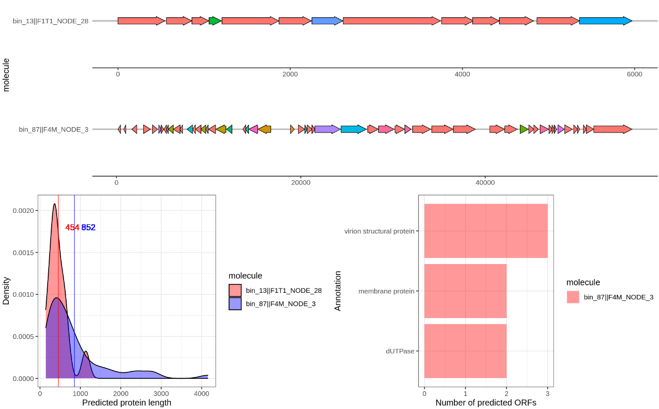
Compare several of the following contigs:
bin_87||F4M_NODE_3
bin_01||F1M_NODE_1
bin_62||F3M_NODE_2
bin_13||F1T1_NODE_28
HHblits
Take a closer look at the contigs
bin_01||F1M_NODE_1vsbin_62||F3M_NODE_2- both crassphages.
What do you notice in this comparison?
Go to Figure 7 of this paper, is this what you thought? How are we going to tackle this?
Annotating two contigs with a different translation table
In the paper a modified version of Prodigal is used. Instead of modifying Prodigal we will use translation table 15 where TAG is considered a coding codon instead of a STOP(*).
- How do we tell Prodigal to use this translation table? wiki
(NOTE: using a different translation table is not supported in meta mode, so we have to use the normal gene prediction here)
We have to go back to the ~/day3/ directory and then run the following
mkdir prodigal_dif_table
cd prodigal_dif_table
touch two_contigs.fasta
cat ../fasta_bins/bin_01.fasta > two_contigs.fasta
cat ../fasta_bins/bin_62.fasta >> two_contigs.fasta
prodigal -i two_contigs.fasta -a two_contig_proteins.faa -o two_contig_genes.txt -f sco -g 15
mkdir single_fastas
seqkit split -i -O single_fastas/ two_contig_proteins.faa
mkdir hhsearch_results
for file in single_fastas/*.faa; do base=`basename $file .faa`; echo "hhblits -i $file -blasttab hhsearch_results/${base}.txt -z 1 -Z 1 -b 1 -B 1 -v 1 -d ../phrog/phrogs_hhsuite_db/phrogs -cpu 1"; done > all_hhblits_cmds.txt
parallel --joblog hhblits.log -j8 :::: all_hhblits_cmds.txt
wget https://raw.githubusercontent.com/rickbeeloo/day3-data/main/parse_hmm_single.py
python3 parse_hmm_single.py hhsearch_results/ two_contig_hhsearch_results.txt ../phrog/phrog_annot_v3.tsv two_contig_genes.txt
Use the script from the previous step (this time loading the two_contig_hhsearch_results) and again visualize the contigs bin_01||F1M_NODE_1 vs bin_62||F3M_NODE_2.
Compare predictions
- How did the prediction change? and what about
bin_01||F1M_NODE_1?
Key Points
Lunch break
Overview
Teaching: 50 min
Exercises: 0 minQuestions
Objectives
Key Points
Clustering proteins
Overview
Teaching: 30 min
Exercises: 30 minQuestions
We now queried our protein sequences directly against the models from the PHROG database. To increase sensitivity of our search we could first build models, more specifically Hidden Markov Models (HMMs), ourselves and query these against the database. Take a look at the EBI description here to get an idea of what this will look like. To build these we will go through the following steps:
- Clustering similar protein sequences together (MMSEQ2)
- Generation of a MSA for each cluster (MAFFT)
- Querying the MSAs against the PHROG models using HHBlits
For our clustering (and thus HMM building) we will also include all viral RefSeq sequences. We have to go back to the ~/day3/ directory and then run the following
mkdir refseq
cd refseq
wget https://ftp.ncbi.nlm.nih.gov/refseq/release/viral/viral.1.protein.faa.gz .
wget https://ftp.ncbi.nlm.nih.gov/refseq/release/viral/viral.2.protein.faa.gz .
wget https://ftp.ncbi.nlm.nih.gov/refseq/release/viral/viral.3.protein.faa.gz .
wget https://ftp.ncbi.nlm.nih.gov/refseq/release/viral/viral.4.protein.faa.gz .
zcat viral* >> refseq_proteins.faa
rm -rf *.gz*
cd ..
RefSeq
- Why would we include RefSeq viral sequences and not just our phage proteins?
- How many RefSeq sequences did we download?
We will create a new FASTA file that has both our predicted proteins and the RefSeq protein sequences (again, check if you are in ~/day3/).
mkdir refseq_clusters
cd refseq_clusters
touch proteins_with_refseq.fasta
cat ../prodigal_default/proteins.faa > proteins_with_refseq.fasta
cat ../refseq/refseq_proteins.faa >> proteins_with_refseq.fasta
Let the clustering begin! (still in the refseq_clusters folder)
mkdir mmseqs_db
mkdir mmseqs_clusters
mmseqs createdb proteins_with_refseq.fasta mmseqs_db/protein.with.refseq.db
time mmseqs cluster mmseqs_db/protein.with.refseq.db mmseqs_clusters/proteins.with.refseq.db tmp -s 7.5 --threads 8
mmseqs createtsv mmseqs_db/protein.with.refseq.db mmseqs_db/protein.with.refseq.db mmseqs_clusters/proteins.with.refseq.db refseq_clusters.tsv
MMseqs2
- Look at the
clusterparameters for mmseqs2, why do we set -s to 7.5? (look at the manual)- How many clusters did MMSeqs2 find? ( see
refseq_clusters.tsv)
To align the sequences within each cluster we first have to generate a FASTA file from them. Querying clusters just contianing one sequence would be the same as our previous query hence we only include clusters satisfying the following criteria:
- At least one prodigal predicted protein (exclusively RefSeq clusters are discarded)
- At least 2 sequences in total
I wrote a script to get the FASTA files from the clusters, align these using MAFFT and then search these against PHROG. However since this combined will take more than 2 hours we will just download the results:
wget https://raw.githubusercontent.com/rickbeeloo/day3-data/main/msa_hhsearch_results.txt
The commands that I used are here:
#  mkdir output
#  python3 ../scripts/get_cluster_fastas.py output proteins_with_refseq.fasta refseq_clusters.tsv --min_seqs 2
# for file in output/Fasta/*.fasta; do name=`basename $file`; mafft --globalpair --maxiterate 1000 $file > ../MSA/${name}; done
# for file in output/MSA/*.fasta; do base=`basename $file .fasta`; hhblits -i $file -M 50 -blasttab output/HMM/${base}.txt -cpu 8 -d ../phrog/phrogs_hhsuite_db/phrogs -v 1 -z 1 -Z 1 -b 1 -B 1; done
# python3 ../scripts/parse_hmm_cluster.py output/HMM/ msa_hhsearch_results.txt ../phrog/phrog_annot_v3.tsv ../prodigal_default/genes.txt refseq_clusters.tsv output/cluster_stats.txt
A look at the clusters
Again create a new Rscript and paste the code from here, then load the msa_hhsearch_results.txt file and generate the figures. Like before it will also save the plot.
Clusters
- What do you see?
There are some proteins that are found frequently in different viruses and our contigs (see NAs in the figure). Lets take a look at 386 NA with sequence:
MGYDYEMILDEVDKLSLQGRVEEAKEFVRELVPPLFAIDFTNLMELIERNTYKL
Blast the protein against NCBI.
Blast
Did you find a functional annotation?
We tried a single protein search and a more sensitive profile-profile search. What else can we do to get a clue about the function of this protein?
Bonus
One other thing we can try is to predict its protein structure and compare that to the database as even with deviating amino acids structures can be similair. Go to the alphafold notebook and follow the instructions. Basically replace the
query sequenceby the protein seqence above and then press the “play arrow” for each cell in the notebook from top to bottom - each time waiting for the previous one to finish. Then download the zip file (unzip it) and choose one of the.pdbfiles to upload it to http://shape.rcsb.org/ (paper) to perform a search against the PDB database. When an assembly is availalbe (assembly column) you can press on the image to view the protein and its annotation in the database.
- Do the results give you any clues?
We can look a bit more in detail by aligning our protein structure with that of a match. For example align it with 4HEO. Press the
Download files > pdb format. Then go to TM-align and input one of the predicted structure pdb files and that of 4HEO.
- Does the alignment look good?
Key Points
Integrating annotations
Overview
Teaching: 30 min
Exercises: 30 minQuestions
Now it is time to compare the model search with that of the invidual proteins. We will load the HHblits results from the “single” and “cluster” search in R and then join the tables to see the differences.
Our anotation files (for both “single” and “cluster/msa”) only contain information for a protein when there actually was a match found. However, we are also interested in all the proteins that didn’t get annotated either way. Hence we will first grep those from the proteins.faa file. Being in the day3 folder the command can look like this:
grep "^>" prodigal_default/proteins.faa | cut -f 2 -d ">" | cut -f 1 -d " " > all_prodigal_genes.txt
And then you can use R code like this to look at the differences and similarities, again change the file paths.
library(dplyr)

# Load all the proteins we have
all.proteins <- read.table('all_prodigal_genes.txt') %>% pull(V1)

# First load the original annotation
single.anno <- read.table('hhsearch_results.txt', comment.char = '', sep = '\t', header = T, na.strings = "")

# Load the cluster anno too
cluster.anno <- read.table('msa_hhsearch_results.txt', comment.char = '', sep = '\t', header = T, na.strings = "")

# Now lets clean the tables a bit
single.anno <- single.anno %>% select(protein = query, target, annot, category)
cluster.anno <- cluster.anno %>% select(protein = member, target, annot, category, cluster.ref = reference)

# Change datatype
single.anno$annot <- as.character(single.anno$annot)
cluster.anno$annot <- as.character(cluster.anno$annot)

# Join them
res <- cluster.anno %>%
  filter(grepl('bin_', protein)) %>%
  left_join(single.anno, by = 'protein', suffix = c('cluster', 'single')) %>%
  mutate(protein = as.vector(protein))

# Cluster search found things that were not found by single
cluster.better <- res %>% filter(is.na(annotsingle) & !is.na(annotcluster))

# Both did find a result but it's an "unknown function"
both.uknowns <- res %>% filter(is.na(annotsingle) & is.na(annotcluster))

# Different annotation
dif.annot <- res %>%
  filter(!is.na(annotsingle) & is.na(annotcluster)) %>%
  filter(annotsingle != annotcluster)

# Consensus annotation
conc.annot <- res %>%
  mutate(annot = case_when(
    is.na(annotsingle) & !is.na(annotcluster) ~ annotcluster,
    is.na(annotcluster) & !is.na(annotsingle) ~ annotsingle,
    !is.na(annotcluster) & !is.na(annotsingle) ~ annotsingle,
    TRUE ~ 'NA'
  ))

# What did we actually annotate (including unknown)
annotated.proteins <- conc.annot %>% filter(!is.na(annot)) %>% pull(protein)


# You might have noticed that this only includes clusters that
# were actually mapped to a PHROG annotation (even though that might be "unknown")
# in either the single protein search or cluster search, but it does not include
# proteins that did not get any hit for both searches. To get all proteins
# that were not annotated at all we get the difference between `all_proteins`
# and annotated.proteins
not.annotated <- setdiff(all.proteins, annotated.proteins)
We will now only look at the “annot” columns, so annotsingle and annotcluster. Use View to view several of the dataframes we created with the above code, such as the both.unknowns and not.annotated.
Compare annotations
- Was our profile search approach able to annotate proteins that, using the single search, remained unannotated? If so how many?
- How many proteins didn’t get annotated in both the single and cluster search?
Key Points
Inspecting the MSAs
Overview
Teaching: 10 min
Exercises: 30 minQuestions
Quality of the multiple sequence alignment
If the MSAs we base our search on are of poor quality we cannot expect to find matches when querying the PHROG database.
MSA quality
- Think of what factors will influence the quality of our MSAs
For a small set of proteins we can manually inspect the MSAs, however, for thousands of proteins this will take too long. Hence I used MstatX to automatically assess the quality of the MSAs.
Among one of the factors that might influence the quality of our MSAs is our clustering using mmseqs2 - the input for mafft. Specfically the parameters we chose, like the sensitivity (-s), and also the default values for identity (--min-seq-id) and coverage(-c). Ideally we would try different values and carefully read the manual on how to choose the most suitable parameters (e.g. here for the coverage). For now I ran MstatX on all the MSAs from the other step. You can see the distribution here:
You can get the MSA for the highest entropy MSA here and the lowest entropy MSA here. Install Jalview from here and visualize the alignments.
Entropy values
- In Jalview, can you explain the high and low entropy values?
- Do you think high, middle or low entropy would be the best to do a model search?
Key Points
Install R package
Overview
Teaching: 0 min
Exercises: 10 minQuestions
install Tidyverse in the background
We will first install the Tidyverse R package as it can take some time to install. Open Rstudio NOT from within a conda environment, instead use the one that is pre-installed of the system. You can find it through the button in top left corner of the screen > programming > Rstudio.
Next, install Tidyverse:
install.packages('tidyverse')
While Tidyverse is installing please listen to the lecture.
Key Points
Start the installation of R package and continue with the next lesson
Clustering and taxonomic classification of uncultivated viral genomes
Overview
Teaching: 0 min
Exercises: 15 minQuestions
What are we going to do today?
Objectives
Viral taxonomy is a very active field. As you know by now, the number of viral sequences is increasing rapidly in multiple databases, reflecting the discovery of uncultivated viruses with metagenomics as well as other methods. The fact that similar sequences are found in different places indicates that the virus is really replicating. Some of these sequences can be directly placed into the viral taxonomy at the species or genus rank, for taxa that are described with the International Committee on Taxonomy of Viruses (ICTV). In case new viral lineages are discovered, ICTV hopes that researchers will submit taxonomy proposals to register the lineage as an official taxonomic group. Specific properties of this group can be described, such as the set of hallmark genes that characterises the Schitoviridae. This bookkeeping is important so that virologists and viral ecologists with a new viral sequence know what they are dealing with, and what the likely properties of the virus are. Currently there is no single best method (or consensus) to classify all viruses: methods differ depending on the taxonomic rank (say, family or species), but they can also vary among different types of viruses.
Today we will use different approaches to try to taxonomically annotate the viral sequences you have recovered in the previous days.
More info:
For more information on taxonomic classification you can read the Perspective on taxonomic classification of uncultivated viruses (Dutilh et al 2021).
Key Points
Required data
Overview
Teaching: 0 min
Exercises: 10 minQuestions
prepare data for today
For today we will need the following datasets from the previous days:
- binned sequences (day 1)
- predicted protein sequences for these bins (day 3)
- protein annotations (day 3)
Please check if you can locate these files. If didn’t get that far on the previous days and as a backup we also provide the files for you to download:
# binned sequences
$ wget https://github.com/MGXlab/Viromics-Workshop-MGX/raw/gh-pages/data/day_4/bins_fasta.zip

# predicted protein sequences
$ wget https://raw.githubusercontent.com/MGXlab/Viromics-Workshop-MGX/gh-pages/data/day_4/proteins_bins.faa

# protein annotations
$ wget https://raw.githubusercontent.com/MGXlab/Viromics-Workshop-MGX/gh-pages/data/day_4/proteins_bins_annotation.txt

# MMSeqs2 clusters
$ wget https://raw.githubusercontent.com/MGXlab/Viromics-Workshop-MGX/gh-pages/data/refseq_clusters.tsv

# Vcontact2 output
$ wget https://raw.githubusercontent.com/MGXlab/Viromics-Workshop-MGX/gh-pages/data/day_4/c1.ntw
$ wget https://raw.githubusercontent.com/MGXlab/Viromics-Workshop-MGX/gh-pages/data/day_4/genome_by_genome_overview.csv
Key Points
Homology based search
Overview
Teaching: 0 min
Exercises: 30 minQuestions
If we classify our viral sequences with Blast, in which cases do you expect that blast sequence searches result in good hits? What would you do if your sequence hit different viral (or bacterial) sequences with low coverage of your query sequence, or low sequence identity with the hit?
Objectives
Run megablast on viral contigs
After you’ve assembled metagenomes (day 1) and identified putative viral contigs (day 2), you probably want to know which viruses you’ve recovered – that is, assign taxonomy. The first thing you might want to do is check whether it is a known virus by searching for highly similar viruses in any of the databases. From day 2 you might remember that homology-based searches will only get you so far for identifying uncultivated viral sequences, as a large part of the virosphere is still uncharted. But if your virus has been sequenced & described before you probably want to know that, because it can save you a lot of time.
Blast a few of the binned contigs (from day 1) with Blast by opening the file in a text editor and copying (part) of the fasta sequence in the browser in the field marked ‘Enter Query Sequence’ (see figure “A”). Another option is to use the terminal and select & copy the sequence from the terminal:
# go to folder containing bins from day 1
cd /path/to/bins/from/day1

# check which files are present
ls

# pick a bin (e.g. bin_03.fasta) and look at the first 150 lines of that file
head -100 bin_03.fasta

# or use a combination of 'head' and 'tail' to look at a part somewhere in the middle:
head -4000 bin_03.fasta | tail -250

# Note:
# bins typically contains multiple contigs. If you want to blast multiple contigs,
# just make sure that they contain the header lines (starts with ">") in between.
# You can select the results for each of the sequences on the blast results page.

# Note:
# Don't do this for many or very long sequences since we don't want to overload the blast server.
# If you want to search a lot of sequences in this way (NOT recommended!) you would
# use a command line blast version on your own server.
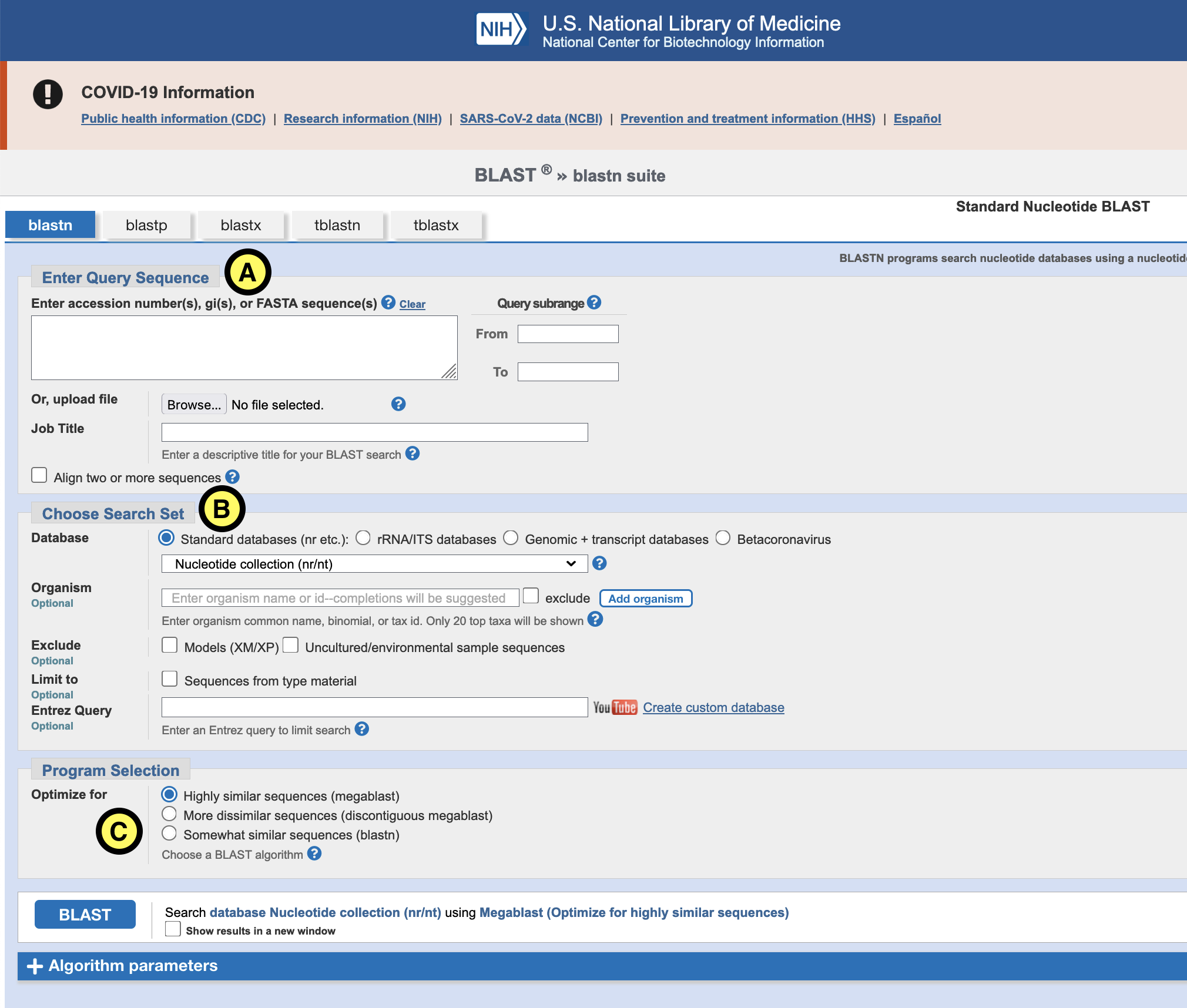
For “Database” (B) select Nucleotide collection (nr/nt) or RefSeq Genome database. For ‘Programs selection’ (C) choose Megablast. This is the least sensitive, but also the fastest of the different blast flavors.
Click the blue “Blast” button and wait for the results.
Question: Blast results
Inspect the “Descriptions”, “Graphic summary” and “Taxonomy” tabs to answer the following questions:
- What is the top hit? Do you have a single good hit or multiple hits?
- What is the length of aligned region in the query and target?
- What is the percent identity?
- Can you assign the contig to a taxonomic group? Why (not)?
Try a few different sequence parts of the bin, and try a few other bins. Discuss what you find with your neighbour.
Key Points
Sometimes you might find a good hit, for example for the crAssphage bins, or for many of the well-described viruses infecting humans. In other cases, we need more sophisticated search strategies to assign a given viral sequence to a previously described taxon.
Clustering viral sequences based on shared proteins
Overview
Teaching: 0 min
Exercises: 60 minQuestions
Can we cluster viral sequences based on shared protein clusters?
Objectives
Identify putative crAssphage bins
Another way to classify your genomes is to cluster them based on the gene content of the genomes. We will first visualize the protein content of the viral bins using a sort of heatmap that reflects the phylogenetic profiles of the different protein clusters generated on day 3. For this we are going to use the MMSeqs2 protein clusters (PCs) you made in the previous day from your binned sequences.
First, open a terminal and make a new folder for today’s results to keep things organised:
$ cd /path/of/viromics/folder/
$ mkdir day4
$ cd day4
We provide an R script for this part of the analysis. However, if you are familiar with making heatmaps and clustering data in R (or any other programming language), please feel free to read along and make your own script.
# Download the script from github:
$ wget https://raw.githubusercontent.com/MGXlab/Viromics-Workshop-MGX/gh-pages/code/day4/clustering.R
Tidyverse should have installed by now: go back to Rstudio and check. If you have trouble installing Tidyverse please contact any of the assistants.
Create a new project in Rstudio (file > create new project > Existing directory) and select the
/path/of/viromics/folder/day4 folder.
Open the clustering.R script you just downloaded. It should be in the lower
right pane under “Files”
Question 1: Data exploration.
Follow the R script up until line 18. Make sure to change the file paths so that they point correctly, and read the comments to understand what you’re doing.
Take a moment to look at what was in the data you just loaded.
- What’s in each of the different columns?
- What information do you still lack to be able to cluster genomes based on protein content?
The RefSeq proteins have unique protein IDs (e.g. YP_009124822.1), but no identifier that tells us to which genome they belong.
We will download this information and some additional taxonomic metadata from
NCBI virus.
Go to Find Data > Bacteriophages (A):
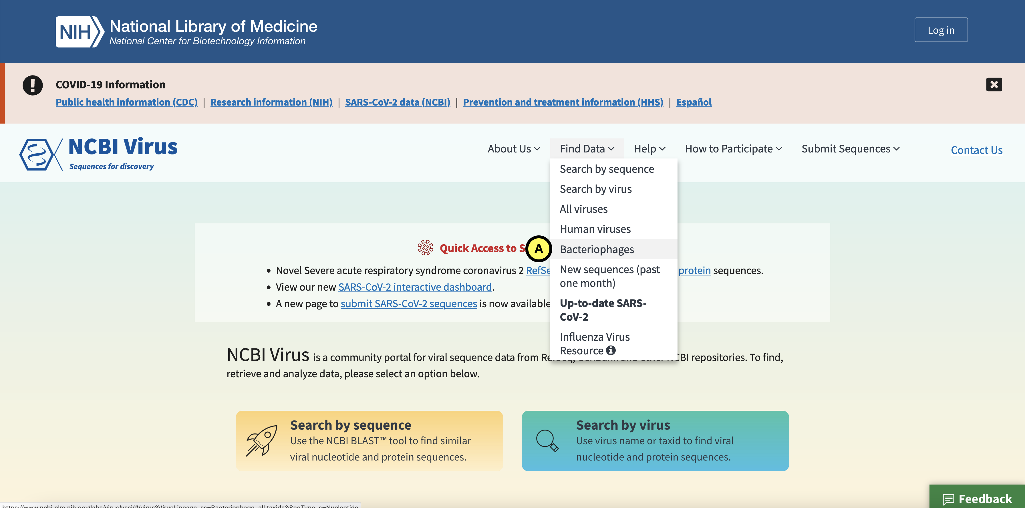
Click the Protein tab (B), and in the left (C) select complete and partial RefSeq genome completeness. Next click “Download” (D):
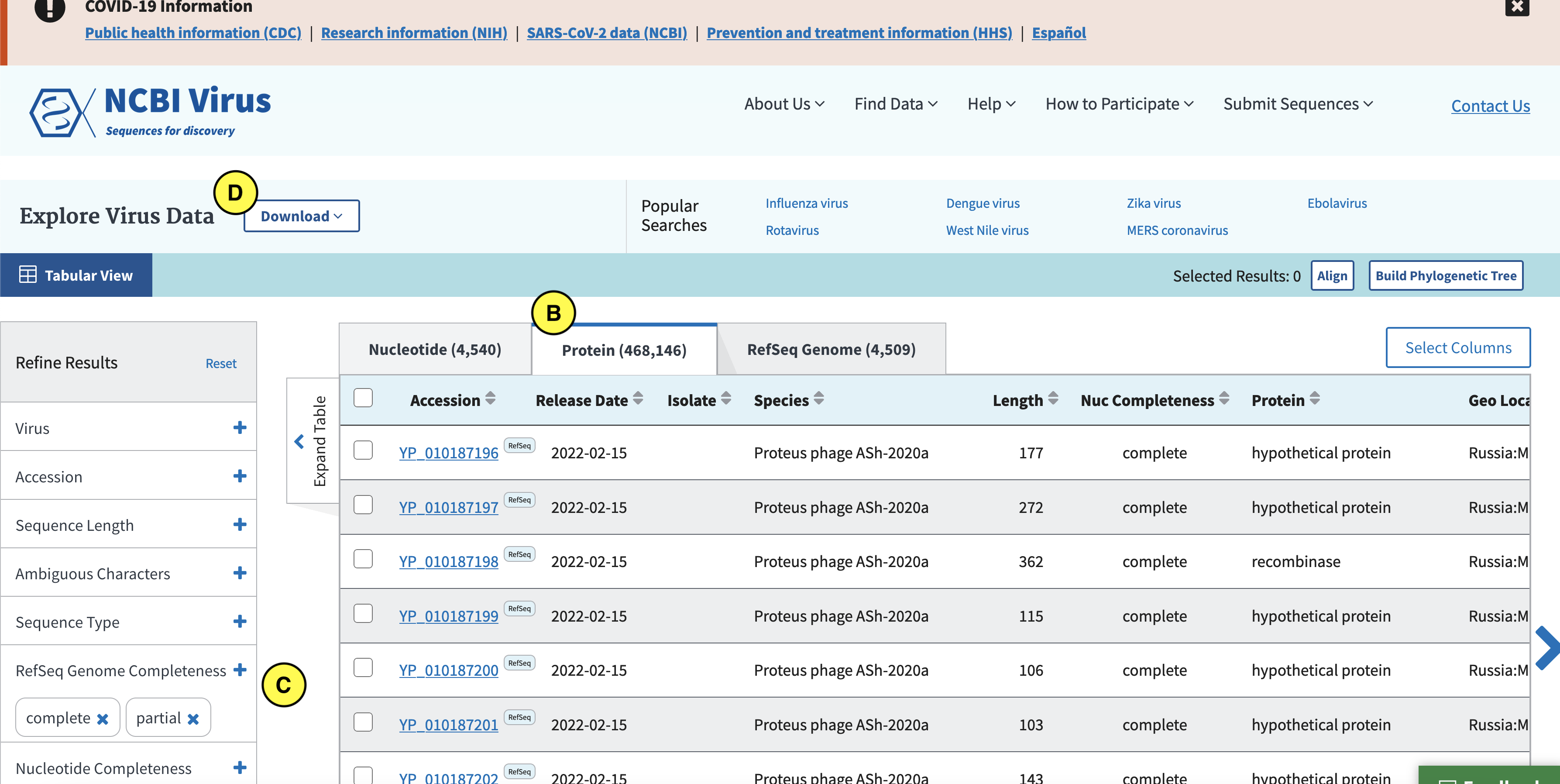
In the screen that pops up click Current table view results, csv format (E):
Download all records:
Select Accession, Species, Genus, Family, Length, Protein, and Accession with version (F):
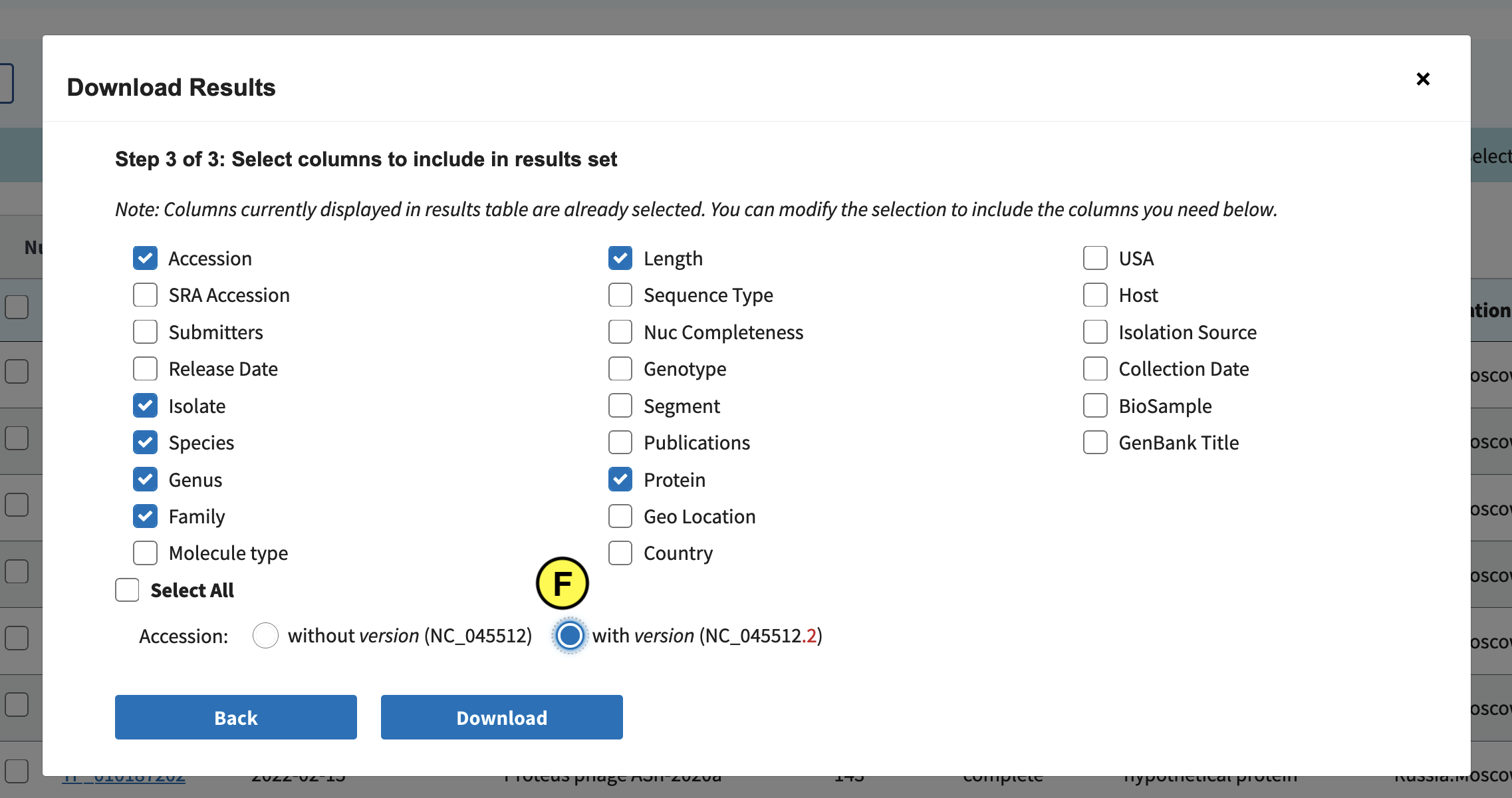
Finally click Download. Downloading might take long, so as a backup we’ve also included the file in the Github repo:
# Download the metadata from github:
$ wget https://raw.githubusercontent.com/MGXlab/Viromics-Workshop-MGX/gh-pages/data/sequences_bac.csv
Question 2: Clustering contigs based on shared protein clusters
Go back to the R script and follow the steps up to line 87.
Look at the heatmap. Are there any core viral genes? Can you find closely related bins?Solution
We observe:
- sparse clustering indicates high viral diversity in terms of gene content.
- No genes are shared between all bins. This suggests there are no core genes.
- some bins share some PCs, and might be closely related
Example heatmap
Question 3: How can we assign taxonomy to our bins?
Right now we see a few bins that are perhaps related to each other because they share a few proteins. So we know they are similar, but not what they are. Can you think of a way to annotate these sequences through clustering?
Solution
To annotate our contigs, we need to add sequences with known taxonomy and check if they cluster with our bins.
In other words, we need to include our RefSeq protein clusters and genomes.
Would you add all RefSeq genomes? Why (not)?
Hint: check how many RefSeq genomes are in our protein cluster dataset.
Next, we are going to add crAssphage genomes and protein clusters from our RefSeq set, to see if we can find any crAssphage-like phages in our assembled bins.
Question 4: Heatmap with crAssphage RefSeq genomes
follow steps in the R script until the end of the script.
Look at the new heatmap. Interpret what you see.Solution
- We see a couple of different clusters of RefSeq crAssphage Genomes
- Some of our bins cluster with these crAssphages, so perhaps these sequences are also crAssphages?
Example heatmap with crAssphages
Challenge: Try to classify more bins by including other RefSeq sequences
See if you can annotate any of the other bins by a similar method.
Include PCs and genomes for another viral genus or species that you expect to be present in the human gut microbiome (use google to find which phages you would expect).
Modify the script to filter the RefSeq sequences for that taxon, and make a heatmap. Can you classify any of the other bins?
Key Points
Installing and running Vcontact2
Overview
Teaching: 0 min
Exercises: 30 minQuestions
How do we install and run Vcontact2?
Objectives
Install & Run Vcontact2
Another way to visualise genome similarity based on gene sharing is by graphing them as networks. Vcontact2 is a popular tool perform taxonomic classification that uses gene sharing networks.
In short, Vcontact2 uses a two step clustering approach to first cluster proteins into protein clusters (PCs, similar to what you did in day 3) and then clusters genomes based on how many PCs they share. It then applies parameterised cut-offs to decide whether genomes are similar enough to be considered as belonging to the same genus. For more information please read the Vcontact2 paper or repository.
We will start vContact2 before lunch because it takes ~1 hour to run for our dataset. In the afternoon we will analyse the output.
0. Install Vcontact2
Installing vcontact2 is a bit of a mess due to some dependencies, so we will create a separate conda environment. Open a new terminal and do the following:
# create a new conda environment
$ conda create --name vContact2 python=3.7
$ conda activate vContact2

# pandas need to be 0.25.3
$ conda install pandas=0.25.3
$ conda install -c bioconda vcontact2
$ conda install -c bioconda -y mcl blast diamond

# Downgrade Numpy
$ conda install -c bioconda numpy=1.19.5

# Install ClusterONE
# Please remember where you put it, as you need to specify the path to cluster one when running vcontact2.
# cd /path/to/viromics/folder
wget --no-check-certificate https://paccanarolab.org/static_content/clusterone/cluster_one-1.0.jar
Next we are going to run vContact2. Vcontact2 comes with a test dataset to verify if it installed correctly, but because running this test takes ~1 hour we are going to skip it and directly test by analysing our own dataset.
Task 1: Create vContact2 input files
Read the Vcontact2 manual. What input do you need? Can you create these files?
solution
You need two files:
- A FASTA-formatted amino acid file.
- A “gene_to_genome” mapping file, in either tsv (tab)- or csv (comma)-separated format.
echo "protein_id,contig_id,keywords" >> gene_to_genome.csv
cat proteins_bins.faa | grep ">" | cut -f 1 -d " "  | sed 's/^>//g' > protein_ids.csv
cat protein_ids.csv | sed 's/_[0-9]*$//g' >contig_ids.csv
paste -d , protein_ids.csv contig_ids.csv >> gene_to_genome.csv
Task 2: run Vcontact2
Check the Vcontact2 manual to find out how to do this.
solution
From within the vcontact environment, run:
vcontact2 --raw-proteins /path/to/proteinfile.faa --rel-mode 'Diamond' --proteins-fp /path/to/gene_to_genome.csv --db 'ProkaryoticViralRefSeq94-Merged' --pcs-mode MCL --vcs-mode ClusterONE --c1-bin /path/to/clusterone --output-dir /path/to/output/dir
Now that vContact2 is running enjoy your lunch break!
Key Points
We’re running vContact2 over lunch because it takes around an hour to finish
Lunch break
Overview
Teaching: 0 min
Exercises: 50 minQuestions
Objectives
Eat lunch
Key Points
Check Vcontact2
Overview
Teaching: 0 min
Exercises: 10 minQuestions
Did we successfully run Vcontact2?
Objectives
Check the terminal to see if vContact2 finished successfully.
Key Points
Phylogeny based on marker genes
Overview
Teaching: 10 min
Exercises: 50 minQuestions
Can we use marker genes to infer phylogeny and taxonomy?
Objectives
Make a phylogeny based on terminase large subunit
As we discussed this morning, we can use the evolutionary history of certain genes to address questions about the evolution and function of viruses. Although there are no universal marker genes for all the viruses, but many viral lineages share one or more marker genes that can be used for to assess relationships between the viruses carrying them. Our samples were metaviromes from the human gut. Like many biomes, the human gut virome contains many bacteriophages, and we can use the large subunit of the terminase (TerL) gene to study how they are related. The TerL gene, present in all members of the Caudovirales, pumps the genome inside an empty procapsid shell during virus maturation by using both enzymatic activities necessary for packaging in such viruses: the adenosine triphosphatase (ATPase) that powers DNA translocation and an endonuclease that cleaves the concatemeric genome at both initiation and completion of genome packaging.
Activate environment
# Download, create and activate environment
$ wget https://raw.githubusercontent.com/MGXlab/Viromics-Workshop-MGX/gh-pages/code/day4/day4_phyl_env.txt
$ conda create --name day4_phyl --file day4_phyl_env.txt
$ conda activate day4_phyl
TerL sequences from bins and database
Use the script get_terl_bins.py to gather the large terminases annotated in the
bins. This script looks at the annotatin table generated on day3, select the proteins
annotated as terminase or large terminase subunit, and gets their sequences from
the FASTA file with all the proteins. Have a look at the help message to see the
parameters you need. Save the results in bins_terl.faa.
# Run the script get the bins terminases
$ wget https://raw.githubusercontent.com/MGXlab/Viromics-Workshop-MGX/gh-pages/code/day4/get_terl_genes.py
$ python get_terl_genes.py ...
As reference set we will use the TerL found in the ICTV database. Since this database does not contain Crassvirales (aka crassphages) yet, we will supplement it with a set of representative Crassvirales sequences. Download these sequences and merge them with TerL you just extracted from the bins.
# Download reference set
$ wget https://raw.githubusercontent.com/MGXlab/Viromics-Workshop-MGX/gh-pages/data/day_4/ictv_crass_terl.faa

# merge bins and reference sets
$ cat bins_terl.faa ictv_crass_terl.faa >  bins_ictv_crass_terl.faa
Multiple sequence alignment
Align the sequences using mafft. Check the manual for more information.
Alignment algorithm
Have a look at the different algorithms available with MAFFT. Which one do you think best fits our data? Can you use one of the most accurate?
Once MAFFT has finished, use trimal remove positions in the alignment with gaps in more than
50% of the sequences. Check the help message to know more about the parameters.
Infer the TerL phylogeny
Use fasttree to infer the TerL phylogeny from the multiple sequence alignment. Once
finished, upload the tree to iToL. Add taxonomic annotation
(itol_ictv_crass_colors.txt) in the Datasets section for a better understanding of the tree.
# Download reference set annotation
$ wget https://raw.githubusercontent.com/MGXlab/Viromics-Workshop-MGX/gh-pages/data/day_4/itol_ictv_crass_colors.txt
Bins in the tree
- Where do our (bins) terminases fall?
Viral families in the tree
- Do the families cluster, and can you explain why?
Check this taxonomy proposal from ICTV and Turner et al., 2021
Key Points
Gene sharing networks with Vcontact2
Overview
Teaching: 0 min
Exercises: 90 minQuestions
Can we assign a genus-level taxonomic annotations with vContact2?
Do contigs from the same bin cluster together?
How do the vContact2 results compare to other methods we used?
Objectives
Learn to use Vcontact2 and Cytoscape
Assign genus-level taxonomy to assembled viral sequences
Identify potentially wrongly binned contigs
0. Preparations
If you didn’t successfully finish running vcontact2 please download the vContact2 data from here:
# Vcontact2 output
$ wget https://raw.githubusercontent.com/MGXlab/Viromics-Workshop-MGX/gh-pages/data/day_4/c1.ntw
$ wget https://raw.githubusercontent.com/MGXlab/Viromics-Workshop-MGX/gh-pages/data/day_4/genome_by_genome_overview.csv
Task: Check vContact2 output files
Check the vContact2 manual to see what output files are generated by vContact2.
Which files do you need?
What information is contained in these files?
Which sequences are included in the output?
Step 1: Install Cytoscape
To visualise our gene sharing networks we are going to install Cytoscape. Go to https://cytoscape.org/download.html and download Cytoscape. Next, install it:
cd /path/to/downloaded/cytoscape_file
chmod +x Cytoscape_3_9_1_unix.sh
./Cytoscape_3_9_1_unix.sh
And follow the instructions on the screen to install Cytoscape. If everything works out you should end up with a Cytoscape shortcut on your desktop.
Step 2: Load network in Cytoscape
Open Cytoscape with the desktop shortcut. Cytoscape has a graphical interface that might be a bit overwhelming at first.
- Follow steps 7-10 from this manual to load the network file into Cytoscape.
- after you’ve removed the duplicate edges and self loops (see manual linked above), load the
gene_to_genome_overview.csvfile by file > import > table from file and selecting it. In the window that pops up please select the following (see image):- add to a selected network
- import data as Node table columns
- click genome in Preview and select the key icon If this all worked correcly, you should now have information about the nodes in the “node table” (E in the second figure below)
Step 3: Change the network layout:
‘Layout > Edge-weighted Spring Embedded layout’, and select the column with the numeric data (probably column 3). This places genomes that share more protein clusters closer together.
Step 4: Explore the data and explain what you see
Take a moment to look at what you see. Why are the networks and nodes organised like this? Inspect a few nodes. Play around with a few colour schemes. Look at the clustering status of nodes that are close together in the network.
(read the tips below)
Some tips for exploring the network in Cytoscape:
- You can select a node by clicking on it. This will display info (Name, order, clustering status) about that node in the “Node table” (E) in the bottom half of Cytoscape.
- You can select multiple nodes by pressing ctrl and drawing a box around them. The selected nodes will be highlighted in yellow in the network, and their info will be shown in the node table.
- Search for specific nodes with the field in the top right corner (F). For example, you can search for nodes in bin 1 by entering “bin_01*” (use the * wildcard!) and press enter.
- You can colour the node based on different things, such as clustering status, viral cluster number, or a taxonomic rank such as genus. What do each of these terms indicate? Refer to the Vcontact2 manual (under “VC statuses”) or paper if necessary.
To change the node colour, go to the Style panel (see figure, A) > Fill colour (B). For example you can colour the nodes for Genus by selecting “Genus” in the column field, then selecting “Discrete mapping” as mapping type, and finally generating a colour scheme by right clicking Discrete mapping > Mapping value generator and then selecting a colour scheme (C).- The ‘Always show graphic details’ button (G) can be turne on to apply the graphic style to the network at each zoom level (at a slight performance cost).
##Explore the network to answer the following questions:
- Can you find reference genomes (i.e. not from our assembly) that Vcontact classified as the same genus? What does this mean?
- Can you find the bins that clustered with crAssphages in the heatmap (lesson 4) back in the network?
- Does the vContact2 approach also How closely related to crAssphages are they?
- Do the contigs from bins (for example the putative crAssphage bins) clustered together in the network? Why (not)?
- We clustered contigs, not bins. What possible effects would expect of instead clustering bins? Which method would you prefer?
- What would you do if you wanted to more precisely wanted to determine the taxonomic relationship of the putative crAssphage-like bins?
- Can you find other bins from the assembly (look at the heatmap) that you now can assign a genus to?
- Can you find contigs that were perhaps incorrectly binned together? (how would you see this in the network)?
Key Points
Assessing viral contigs completeness and contamination
Overview
Teaching: 0 min
Exercises: 30 minQuestions
Which signals can we use to assess how complete and/or contaminated is our viral contig?
Objectives
# Install checkv in the environment
$ conda install -c bioconda checkv

# Download database
$ mkdir checkv_database
$ checkv download_database checkv_database
Run checkv end_to_end for the bins using a for loop in Bash. In the folder
with your bins in FASTA format (bin_00.fasta, bin_01.fasta…):
# run checkv for each bin, sequentially
$ mkdir checkv_results
$ for bin in b*.fasta; do checkv end_to_end -d <PATH_TO_DATABASE> -t 7 $bin checkv_results/${bin%.fasta} ; done
While it is running, have a look at the quality_summary.tsv files of the bins
already finished.
- Is there any contig suspicious of not being a virus?
- Is there any bin suspicious of containing more than one species?
Key Points
Track alpha and beta diversity dynamics of viral/microbial communities
Overview
Teaching: 120 min
Exercises: 0 minQuestions
What is compositional data?
How to do compositional data analysis?
What is Hill Number?
Objectives
Compositionality
Hill number of alpha divesity
Basic ecology
Watching:
- Alpha Diversity Microbiome Discovery 7: Alpha Diversity
- Beta Diversity Microbiome Discovery 8: Beta Diversity
Compositional data and analysis
Compositionality
- Definition: a D-part composition is positive real vector of D components describing the parts of some whole. It only carries relative information between the parts.
- Three principles of compositional data (analysis)
- Scale invariance
- Permutation invariance
- Subcompositional coherence
Reading:
- Microbiome Datasets Are Compositional: And This Is Not Optional (Gregory B. Gloor et al fmicb 2017)
- A field guide for the compositional analysis of any-omics data (Thomas P Quinn et al GigaScience 2019)
- Exploring MGS Bias (Ryan Moore)
Watching:
- Compositionality Microbiome Discovery 19: Compositionality
- Compositional data analysis Compositional Data Analysis Approaches to Improve Microbiome Studies: from Collection to Conclusions
Alpha diversity
Reading:
- Estimating diversity in networked ecological communities Amy D Willis et al Biostatistics 2022
- Hill number as a bacterial diversity measure framework with high-throughput sequence data Sanghoon Kang et al nature 2016
Differential abundance and correlations
Reading:
- Understanding sequencing data as compositions: an outlook and review Thomas P Quinn et al bioinformatics 2018
- propr: An R-package for Identifying Proportionally Abundant Features Using Compositional Data Analysiss Thomas P. Quinn et al Biostatistics 2022
Acknowledgement
The content and material of the course today is heavily based on the MCAW-EPSCoR Microbial Community Analysis Workshop by Viral Ecology and Informatics Lab in the University of Delaware.
Key Points
Next Generation Sequencing data is compositional and should be analyzed using compositional data analysis methods
Hill number is linear and more intuitive than original alpha diversity measures
Rstudio set up from Conda environment, package installment and data download
Overview
Teaching: 0 min
Exercises: 30 minQuestions
Objectives
Create Conda environment from the terminal
Install few extra R packages
Loading data and packages into R.
Using the FeatureTable package.
Install environment
Open the terminal.
Navigate into your working directory in the terminal(e.g. day5/).
Download the environment file.
Create the conda environment using the command lines below explicitely. Note that you should use --file instead of -f in the line of conda create ....
Activate the environment.
Export a library into the environment. Replace prakXXX with your own computer ID in the line of export ....
Initiate Rstudio from the shell.
cd day5/
wget https://raw.githubusercontent.com/lingyi-owl/jena_workshop/gh-pages/data/day5_env.txt
conda create --name day5_env --file day5_env.txt
conda activate day5_env
export LD_LIBRARY_PATH=/mnt/local/prakXXX/anaconda3/envs/day5_env/lib
rstudio
Install extra packages
In RStudio interface openned from the previous step, install the packages below.
Download the FeatureTable package to your working directory.
Install the package in RStudio using the scripts below. Skip updates when installing breakaway. It might take a while to install breakaway.
# install featuretable
install.packages("featuretable_0.0.10.tar.gz", repos = NULL)
install.packages("remotes")
library(remotes)
# install DivNet
remotes::install_github("adw96/breakaway")
remotes::install_github("adw96/DivNet")
# install biplotr
remotes::install_github("mooreryan/biplotr")
# install vmikk/metagMisc
remotes::install_github("vmikk/metagMisc")
Load packages
Load packages in the order below to avoid conflicts.
library(phyloseq)
library(breakaway)
library(DivNet)
library(ggplot2)
library(gridExtra)
library(magrittr)
library(picante)
library(reshape2)
library(biplotr)
library(zCompositions)
library(vegan)
library(ggdendro)
library(ALDEx2)
library(featuretable)
library(ComplexHeatmap)
library(metagMisc)
R will throw an error if any of the packages are not installed.
Download the data
The input data for the workshop today can be downloaded through github. Store these data in the directory of day5/data/.
It is a microbial 16S dataset from a pond study through a seasonal change period with two size fractions (0.2µm. & 1µm).
We used this microbial 16S dataset for this workshop because it has enough sequencing depth and sample numbers to conduct ecological analysis.
The twins phages dataset is not big enough to show variance between samples.
The principles to study viral ecology and microbial ecology should be the same.
Thus, you can apply the analysis methods you learned from today’s workshop to your viromics data in the future.
# asv count table
wget https://raw.githubusercontent.com/lingyi-owl/jena_workshop/gh-pages/data/asv_count_table.txt
# taxonomy column table
wget https://raw.githubusercontent.com/lingyi-owl/jena_workshop/gh-pages/data/taxonomy_columns.txt
# sample metadata table
wget https://raw.githubusercontent.com/lingyi-owl/jena_workshop/gh-pages/data/sample_metadata.txt
# asv tree file
wget https://raw.githubusercontent.com/lingyi-owl/jena_workshop/gh-pages/data/asv_FastTree.newick
# environment data by month table
wget https://raw.githubusercontent.com/lingyi-owl/jena_workshop/gh-pages/data/env_data_by_month.txt
Load data
Load data to R. Construct and save a featuretable object and a phyloseq object using the provided data for further usage.
Before you load the data, make sure that the name of the feature(ASV) column matches in the
feature(ASV) count table and the taxonomy table. They will not match by default. My labels
for both are “ASV”
Load the ASV count table, taxonomy table, and sample metadata using the read.table()
function:
# ASV table with raw counts
counts <- read.table("data/asv_count_table.txt",
# tells the function that rows are separated by a tab
sep = "\t",
# logical confirming that the table already has headers
header = TRUE,
# make the first column of the table into row names
row.names = 1)
# taxonomy info for the ASVs
taxonomy <- read.table("data/taxonomy_columns.txt",
sep = "\t",
header = TRUE,
row.names = 1,
na.strings = c("", "NA"))
# sample metadata
sample_data <- read.table("data/sample_metadata.txt",
sep = "\t",
header = TRUE,
row.names = 2)
# phylogenetic tree of ASVs
tree <- read_tree("data/asv_FastTree.newick")

# make and save featuretable object
pond_ft <- FeatureTable$new(t(counts), taxonomy, sample_data)
print(pond_ft)
save(pond_ft, file = "data/pond_featuretable.Rdata")

# make and save phyloseq object
pond_phyloseq <- phyloseq(
otu_table(counts, taxa_are_rows = T),
tax_table(as.matrix(taxonomy)),
sample_data(sample_data),
phy_tree(tree)
)
save(pond_phyloseq, file = "data/pond_phyloseq.Rdata")
Key Points
Exploring data
Overview
Teaching: 0 min
Exercises: 60 minQuestions
What are the differences between absulte abundance and relative abundance?
Why is it necessary to filter out low-abundance features?
Objectives
Plotting absolute abundance, relative abundance and centered-log ratio abundance.
Filtering ASVs to exclude low-abundance features.
Data Overview with FeatureTable
FeatureTable is an R package designed to hold and manipulate sequencing data. FeatureTable makes it very easy to filter data and make abundance plots.
Accessing a FeatureTable object
Load the featuretable object we saved before.
load("data/pond_featuretable.Rdata")
Abundance plots with FeatureTable
Let’s take a quick look at the data before we get started. Here’s how you make a very basic plot of ASV abundance in each sample:
pond_ft$plot()
Onto the plot. First off, the x axis labels aren’t very informative right now. We can
replace the axis labels with more meaningful names using scale_x_discrete():
pond_ft$plot() + scale_x_discrete(labels=pond_ft$sample_data$Sample)
For now, let’s talk about the plot’s appearance. Notice that only 8 ASVs were assigned colors, while the rest were lumped into the “Other” category. The FeatureTable default is to highlight only the top 8 most abundant ASVs.The bars are all different heights because they represent raw ASV counts for each sample, which makes it hard to see patterns, especially in samples with fewer reads overall. The samples are also a little jumbled because they’re still sorted alphabetically by SRA accession, rather than sample name. That’s because the featuretable automatically plots row names on the x axis, which in our case are the SRA accessions. We replaced the names, but not the underlying plotting, so the samples stayed in the same order.
Relative Abundance
Let’s view ASVs in terms of relative abundance rather than raw counts. To do this in FeatureTable, run this code:
pond_ft$
# applies the relative abundance function to samples before plotting
map_samples(relative_abundance)$
plot() + scale_x_discrete(labels=pond_ft$sample_data$Sample)
Again we apply the FeatureTable plot function to pond_ft, but we have some new
code in there. Now, pond_ft is run through the map_samples(relative_abundance)
and the output of that function is fed to plot(). If you use the built-in help feature
(?map_samples()), you’ll see that the map_samples() function is a helper function for
the more general map() in FeatureTable and is shorthand for map(ft, "samples",
relative_abundance). For example, you could also write
pond_ft$map_samples(relative_abundance) as map(pond_ft, "samples",
relative_abundance).
Grouping samples for plotting
Let’s break the data apart a bit and see if we can identify related metadata. Looking at the metadata, the obvious divisions of samples are by Month and Fraction. Let’s start with Month:
pond_ft$
collapse_samples(Month)$
map_samples(relative_abundance)$
# the plot can be customized using ggplot2 functions
plot(num_features = 12, # plot the top 12 features (ASVs)
legend_title = "ASV", # change legend title
xlab = "Month", # change x axis title label
ylab = "Relative Abundance", # change y axis title label
axis.text.x = element_text(angle = 0)) # change x axis text angle
First, we collapse the samples in pond_ft by month using collapse_samples().
Then, relative abundance is calculated for each month using map_samples(). Finally,
we plot the result.
If you have used ggplot2 before, the arguments in the plot function should be familiar
to you because the FeatureTable plot function is a wrapper for ggplot2. The only
argument that is unique to FeatureTable is num_features, which was used to change
the number of highlighted ASVs (i.e. the number of ASVs assigned a color).
The months are out of order, though. Again, we have things in alphabetical order on the x
axis, but in this case we would prefer them to be in chronological order. To fix this, we
can use scale_x_discrete() again.
pond_ft$
collapse_samples(Month)$
map_samples(relative_abundance)$
plot(num_features = 12,
legend_title = "ASV",
xlab = "Month",
ylab = "Relative Abundance",
axis.text.x = element_text(angle = 0)) +
# reorder x axis labels
scale_x_discrete(limits=c("October", "November", "December"))
Make a similar chart for size fraction. Are there possible differences in the microbial community based on size fraction?
Centered-log ratio Abundance
We know that we should transform the raw counts to centered-log ratios when dealing with compositional data analysis. Now let’s view ASVs in terms of centered-log ratio abundance in the class level and compare the clr abundance distribution with absolute and relative abundance using heatmaps.
pond_class_absolute <- pond_ft$collapse_features(Class)$data
rownames(pond_class_absolute) <- pond_ft$sample_data$Sample
absolute_heatmap <- Heatmap(pond_class_absolute)

pond_class_relative <- pond_ft$collapse_features(Class)$map_samples(relative_abundance)$data
rownames(pond_class_relative) <- pond_ft$sample_data$Sample
relative_heatmap <- Heatmap(pond_class_relative)

pond_class_clr <- pond_ft$collapse_features(Class)$replace_zeros(use_cmultRepl = TRUE,method = "GBM")$clr()$data
rownames(pond_class_clr) <- pond_ft$sample_data$Sample
clr_heatmap <- Heatmap(pond_class_clr)

absolute_heatmap
relative_heatmap
clr_heatmap
Filtering ASVs
Filtering is important because low abundance ASVs (e.g. singletons, doubletons) are more likely than high abundance ASVs to be the result of sequencing errors and are often “noise”. ASVs are more robust to this than OTUs, but are still not perfect. Additionally, unfiltered ASV and OTU tables are sparse (i.e. they contain many zeros), which is not ideal for most statistics; It is hard to compare samples based on ASVs that appear in only a few samples. Let’s include only taxa with more than 10 reads (on average) in at least 10% samples.
pond_core_phyloseq <- phyloseq_filter_prevalence(pond_phyloseq, prev.trh = 0.1, abund.trh = 10, abund.type = "mean", threshold_condition = "AND")
print(pond_core_phyloseq) # should have 24 samples and 1842 features
save(pond_core_phyloseq, file = "data/pond_core_phyloseq.Rdata")
In the above examples, I picked 10 for the detection limit (i.e. an ASV with a count of less than 10 will be removed), but it’s an arbitrary cutoff. That being said, any detection limit is generally arbitrary. The minimum sample proportion is also fairly arbitrary. I picked it because it was small enough not to exclude an entire month or size fraction from analysis, but also big enough to filter out rarer OTUs. Normally, you’d probably want to fiddle around with the detection limit and minimum sample proportion and see if the data changes too much.
Key Points
Plot absolute abundance, relative abundance and centered-log ratio abundance plots to see the difference of different abundance measures.
Picking thresholds for filtering can be tricky. Play with the thresholds to filter data based on your questions and your data.
Break
Overview
Teaching: 60 min
Exercises: 0 minQuestions
Objectives
Key Points
Alpha diversity
Overview
Teaching: 30 min
Exercises: 60 minQuestions
What is alpha diversity?
What common alpha diversity indices are there?
How to compare alpha diversity between samples?
Objectives
Running alpha diversity analysis using phyloseq & DivNet.
Interpreting alpha diversity measures.
Statistical comparison of diversity indices usign hill numbers.
Alpha diversity with phlyloseq
Alpha diversity metrics measure species richness and evenness within samples. Unlike ordination and beta diversity, alpha diversity is a within-sample measure that is independent from other samples (although you could choose to pool samples by categories). The Diversity Metrics doc contains information about all of the diversity indices you’ll see coming up, as well as how each index treats richness and evenness. For more thorough explanations, there are a lot of good ecology resources out there.
There is a more thorough breakdown of alpha diversity indices in the Diversity Metrics doc, but here’s a brief rundown because it’s important to know how the indices are calculated when looking through these plots. Chao1 and observed ASVs are similar and both are different from Shannon and Simpson. Chao1 attempts to estimate the number of missing species and is sensitive to singletons. Observed ASVs counts the number ASVs are present in each sample. Therefore, these metrics are only measuring richness. Shannon and Simpson take into account both richness and evenness. The Hill numbers, also known as effective number of species, show the number of perfectly even species that would have to be present to return certain alpha diversity values. They can be calculated from Shannon, Simpson, and a variety of other metrics. See Joust 2006 for details on conversions.
Before we get to the plotting, here’s a way to make sure that the samples are plotted in chronological order.
# make a vector with the samples in the desired plotting order
sample_order <- c("Oct_1_1", "Oct_1_2", "Oct_1_3", "Oct_1_4",
"Oct_02_1", "Oct_02_2", "Oct_02_3", "Oct_02_4", "Nov_1_1", "Nov_1_2",
"Nov_1_3", "Nov_1_4", "Nov_02_1", "Nov_02_2", "Nov_02_3", "Nov_02_4",
"Dec_1_1", "Dec_1_2", "Dec_1_3", "Dec_1_4", "Dec_02_1", "Dec_02_2",
"Dec_02_3", "Dec_02_4")
# turn the Sample column in the sample metadata into a character within the phyloseq object
pond_phyloseq@sam_data$Sample <- pond_phyloseq@sam_data$Sample %>%
as.character()
# use factor() to apply levels to the Sample column
pond_phyloseq@sam_data$Sample <- factor(pond_phyloseq@sam_data$Sample,
levels = sample_order)
Plot alpha diversity using phyloseq
# make and store a plot of observed otus in each sample
# plot_richness() outputs a ggplot plot object
observed_otus_plot <- plot_richness(pond_phyloseq,
  x = "Sample",
  measures = c("Observed"),
  color = "Month",
  shape = "Fraction") +
  geom_point(size = 3) +
  theme_bw() +
  theme(axis.text.x = element_text(angle = 90)) +
  labs(y = "Observed ASVs")

observed_otus_plot
Challenge: Make alpha diversity plots of Chao1, Shannon, and Simpson
Change the value in “measures” to plot Chao1, Shannon and Simpson.
Plot alpha diversity using Hill Numbers
shannon <- estimate_richness(pond_phyloseq,
measures = c("Shannon"))
hill_shannon <- sapply(shannon, function(x) {exp(x)}) %>% as.matrix()
row.names(hill_shannon) <- row.names(shannon)
# merge the hill numbers with the sample metadata based on their
# rownames
hill_shannon_meta <- merge(hill_shannon, sample_data, by =
"row.names")
colnames(hill_shannon_meta)[colnames(hill_shannon_meta) == "Shannon"] <- "Hill"
hill_shannon_plot <- ggplot(data = hill_shannon_meta) +
  geom_point(aes(x = Sample,
  y = Hill,
  color = Month,
  shape = Fraction),
  size = 3) +
  theme_bw() +
  theme(axis.text.x = element_text(angle = 90)) +
  labs(title = "Effective Shannon Diversity Index",
  y = "Effective number of species") +
  scale_x_discrete(limits = sample_order)

hill_shannon_plot
Challenge: Plot alpha diversity using Hill Numbers from Simpson
- get the simpson index values from the phyloseq object and convert to a matrix.
- calculate Hill numbers and convert to a matrix. the formula for Hill numbers from Simpson is 1/(1-D).
- give the hill_simpson matrix some row names.
- merge the hill numbers with the sample metadata based on rownames.
- change the name of the column from Simpson to Hill.
- make and store a ggplot of the Simpson Hill numbers
Arrange all 6 plots on a single grid
You should run that last bit of code (the grid.arrange()) in the R console to get the plots to appear in the plots tab. From there, you can use the zoom feature to open up the plots in a new, bigger window.
grid.arrange(observed_otus_plot,
chao1_plot,
shannon_plot,
simpson_plot,
hill_shannon_plot,
hill_simpson_plot,
ncol = 2)
Discussion:
What do you see from the plot? What do the results of each index tell you about the diversity of the microbial community in each sample?
The observed ASVs and Chao1 measures tell us that the November samples have a higher richness than the Ocotober samples, followed by the December samples. The Shannon, Simpson, and derived Hill numbers tell us that the October samples are more even than the November and December samples. In almost all months, the 1 μm fraction is more even and richer than the 0.22 μm-1 μm fraction.
Plot alpha diversity using phylogenetic information
Phylogenetic trees can also be taken into account when measuring diversity. Faith’s
PD (phylogenetic distance) is one such measure and is equal to the sum of the
lengths of the branches of all members of a sample (or other group) on a phylogeny.
We can calculate it using the pd function from the package picante.
faiths <- pd(t(counts), # samples should be rows, ASVs as columns
  tree,
  include.root = F) # our tree is not rooted
  faiths_meta <- merge(faiths, sample_data, by = "row.names")
  faiths_plot <- ggplot(data = faiths_meta) +
  geom_point(aes(x = Sample,
  y = PD,
  color = Month,
  shape = Fraction),
  size = 3) +
  theme_bw() +
  theme(axis.text.x = element_text(angle = 90)) +
  labs(title = "Faith's phylogenetic distance",
  y = "Faith's PD")

faiths_plot
Alpha diversity with Divnet
The phyloseq package calculates alpha diversity metrics based solely on the numbers in the ASV table. If you were dealing with true counts obtained from an exhaustive ecological survey, calculating diversity metrics as above would be completely valid. Some of the above diversity metrics do try to account for “missing” taxa (e.g. Chao1), but most are not designed to work with compositional data.
DivNet is compatible with Compositional Data Analysis (CoDA). Like the Chao1 metric, DivNet uses the existing data to estimate the number of unobserved taxa. But, the DivNet model is more robust and isn’t nearly as reliant on singletons, which are often the result of sequencing error. DivNet also takes into account that the abundances in the ASV table are not true counts. DivNet can also leverage sample metadata to enhance model fitting. For example, the four quadrants sampled in the pond study are really replicates, leaving size fraction and month as the major sample groups. With DivNet, we can make that clear to the model and make the diversity estimates more accurate.
The downside of DivNet is that it’s inner-workings are more complicated than other packages that calculate diversity metrics. The details are in the DivNet paper. Briefly, DivNet uses Monte Carlo estimation to introduce randomness and calculate an integral for each sample group of interest. DivNet does return plug-in estimates of diversity measures (the same values you get by treating the ASV abundances as true counts), but the Monte Carlo estimation allows DivNet to add error bars.
The other downside is that the R version of DivNet has trouble with larger datasets (like our pond dataset).
In this walkthrough, we’ll collapse our ASVs by taxonomy so we can run DivNet entirely in R. In a real analysis, you would want to run the Rust version DivNet on the ASV table. With more than 1000 or so ASVs, the R version of DivNet would take a long time to finish. With more than ~2500, your R is likely to crash.
# Featuretable is easier to use in this case
load("data/pond_featuretable.Rdata")
# build a model matrix for DivNet
mm <- model.matrix(
~ Month + Fraction,
data = pond_ft$sample_data)

pond_class_counts <- pond_ft$collapse_features(Class)$data
rownames(pond_class_counts) <- pond_ft$sample_data$Sample

# setting the seed for the random number generator makes DivNet
# results reproducible
set.seed(20200318)
# run DivNet
divnet <- divnet(W = pond_class_counts, X = mm, tuning = "careful")
There are a few ways to input data to DivNet. creating a model matrix (like we did here) might be the easiest path if you want to include more than one independent variable in your model. Other ways of inputting data are described in the DivNet vignettes.
You may have noticed that we didn’t include quadrant as a variable in the model matrix. This is because the quadrants are essentially replicates, as we saw in the relative abundance plots.
This next command will show you all the diversity metrics that DivNet calculated.
divnet %>% names
DivNet calculates a lot of different indices, including some beta diversity measures, but we’ll focus on Shannon and Simpson because they’re common in the literature and to compare them to the measurements from earlier.
You can make plots with DivNet, but they’re not the nicest, so we’ll extract the Shannon and Simpson estimates and combine them with the metadata.
# get the Shannon estimates as a data frame
shannon_divnet <- divnet$shannon %>% # access the shannon section
# use summary to get just the numbers
summary %>%
# turn the numbers into a data frame
as.data.frame
# change the name of the column with the sample names to match the
# name of the same column from sample_data
names(shannon_divnet)[names(shannon_divnet) == "sample_names"] <-
"Sample"
# if you’re unclear on how this works, try googling how to change the
# name of a single data frame column in R
# merge the Shannon data frame with the sample metadata
shannon_divnet_meta <- merge(shannon_divnet, sample_data, by =
"Sample")
Challenge: Calculate simpson diversity using DivNet
Fill in the same process as above, but for simpson
Now, you can make some nice ggplots!
shannon_divnet_plot <- shannon_divnet_meta %>%
  ggplot(aes(x = Sample,
  y = estimate,
  color = Month,
  shape = Fraction)) +
  geom_point(size = 3) +
  geom_errorbar(aes(ymin = lower,
  ymax = upper),
  width = 0.3) +
  theme_bw() +
  ylab("Shannon Diversity Index (H) Estimate") +
  scale_x_discrete(limits = sample_order) +
  theme(axis.text = element_text(angle = 90, hjust = 1))

simpson_divnet_plot <- simpson_divnet_meta %>%
  ggplot(aes(x = Sample,
  y = estimate,
  color = Month,
  shape = Fraction)) +
  geom_point(size = 3) +
  geom_errorbar(aes(ymin = lower,
  ymax = upper),
  width = 0.3) +
  theme_bw() +
  ylab("Simpson's Index of Diversity (D) Estimate") +
  scale_x_discrete(limits = sample_order) +
  theme(axis.text = element_text(angle = 90, hjust = 1))


grid.arrange(shannon_divnet_plot, simpson_divnet_plot, ncol = 2)
Note that I call the values produced by DivNet estimates, because the DivNet algorithm estimates the number of missing species over many iterations and calculates the diversity indices over the range of values rather than set values. This is also why the DivNet plots have error bars.
The Shannon diversity estimates from DivNet are lower than the values calculated by phyloseq because we ran DivNet at the Class level instead of the ASV level. Overall though, the results are similar. October has the highest Shannon estimate and November and December are ower. The 1 μm size fraction samples have a higher Shannon diversity than the 0.2 μm fraction samples for all months.
Looking at the Simpson plot, however, you’ll notice a big difference between the DivNet and phyloseq results. Some of the difference is due to estimating diversity at the Class level. But, most of the difference is because the two programs are calculating slightly different forms of Simpson. phyloseq is calculating Simpson’s Index (D), while DivNet is calculating Simpson’s Index of Diversity (aka the Gini-Simpson Index) (1 - D). If we subtract the DivNet Simpson estimate from 1 during plotting, we get an answer that looks more like the phyloseq results.
simpson_divnet_meta %>%
  ggplot(aes(x = Sample,
  y = 1 - estimate, # convert Simpson from D to 1 - D
  color = Month,
  shape = Fraction)) +
  geom_point(size = 3) +
  geom_errorbar(aes(ymin = 1 - lower, # don’t forget to convert
  ymax = 1 - upper), # the error bars!
  width = 0.3) +
  theme_bw() +
  ylab("Simpson's Index of Diversity (1 - D) Estimate") +
  scale_x_discrete(limits = sample_order) +
  theme(axis.text = element_text(angle = 45, hjust = 1))
Now the pattern for Simpson is more similar to the phyloseq result and the Shannon result from DivNet. According to Simpson’s Index of Diversity, the November samples are more diverse than the December samples from the same size fraction.
If we want to calculate Hill numbers (effective number of species, or really effective number of classes in this case) again, we can do it like this:
shannon_divnet_hill <- shannon_divnet_meta %>%
  ggplot(aes(x = Sample,
  y = exp(estimate),
  color = Month,
  shape = Fraction)) +
  geom_point(size = 3) +
  geom_errorbar(aes(ymin = exp(lower),
  ymax = exp(upper)),
  width = 0.3) +
  theme_bw() +
  labs(title = "Effective Shannon Diversity Estimate",
  y = "Effective Number of Classes") +
  scale_x_discrete(limits = sample_order) +
  theme(axis.text = element_text(angle = 90, hjust = 1))

simpson_divnet_hill <- simpson_divnet_meta %>%
  ggplot(aes(x = Sample,
  y = 1/estimate,
  color = Month,
  shape = Fraction)) +
  geom_point(size = 3) +
  geom_errorbar(aes(ymin = 1/lower,
  ymax = 1/upper),
  width = 0.3) +
  theme_bw() +
  labs(title = "Effective Simpson's Index Estimate",
  y = "Effective Number of Classes") +
  scale_x_discrete(limits = sample_order) +
  theme(axis.text = element_text(angle = 90, hjust = 1))

grid.arrange(shannon_divnet_hill, simpson_divnet_hill, ncol = 2)
Significance testing
We can also do significance testing of our DivNet diversity estimates. DivNet is actually one of two related R packages by the same author. DivNet estimates alpha and beta diversity and the package breakaway estimates richness. Breakaway also includes a function, betta(), that can be used to do hypothesis testing of diversity measures calculated using either of the packages.
betta() is a bit confusing. The package author’s tutorial is here.
Key Points
Different alpha diversity indices emphasize on different aspects of alpha diversity. Make choices based on your questions and interpret the results based on the methods you choosed.
Hill numbers are linear and intuitive while original alpha diversicy index values are not.
Beta diversity
Overview
Teaching: 0 min
Exercises: 30 minQuestions
What is beta diversity?
How to compare beta diversity between samples?
Objectives
Replacing zeros with zCompositions.
Centered log-ratio transformation of the count table.
Calculating distance/dissimilarity measures with base R, vegan, and phyloseq.
Performing PCA with biplotr.
Interpreting beta diversity measures through ordination.
Beta diversity ordination
We’re using PCA here (principal components analysis). PCoA (principal coordinate analysis) is similar, and even identical with certain distance measures, but is not compatible with compositional data. There are introductions to compositional data, ordination, and beta diversity in the docs.
Replace zeros with zCompositions and clr transform
zCompositions provides a few methods for handling zeros. Here, I use GBM (Geometric Bayesian multiplicative), but SQ (square root Bayesian multiplicative) and CZM (count zero multiplicative) are also fine choices. Notice that before zero replacement and transformation, we filter out ASVs in at least 25% samples with a detection limit of 20. (We didn’t perform zero replacement or transform counts in the Getting Started or Alpha Diversity lessons because we weren’t dealing with statistics yet. We were purely getting a feel for our data.)
# Include only taxa with more than 10 reads (on average) in at least 10% samples
pond_core_phyloseq <- phyloseq_filter_prevalence(pond_phyloseq, prev.trh = 0.1, abund.trh = 10, abund.type = "mean", threshold_condition = "AND")
print(pond_core_phyloseq) # should have 24 samples and 1842 features
save(pond_core_phyloseq, file = "data/pond_core_phyloseq.Rdata")
pond_core_phyloseq_otu_table <- as.data.frame(phyloseq::otu_table(pond_core_phyloseq))
pond_core_ft <- FeatureTable$new(t(pond_core_phyloseq_otu_table), taxonomy, sample_data)
print(pond_core_ft)
save(pond_core_ft, file = "data/pond_core_featuretable.Rdata")

pond_core_clr <- pond_core_ft$
  # Replace zeros with zCompositions cmultRepl GBM method
  replace_zeros(use_cmultRepl = TRUE,
  method = "GBM")$
  # Then take CLR with base 2
  clr()
Perform PCA on the transformed data
Use the $pca_biplot() command to make a PCA from a FeatureTable object:
# perform PCA using the biplotr package and store it as object p
p <- pond_core_clr$pca_biplot(use_biplotr = TRUE,
# give biplotr access to sample metadata
include_sample_data = TRUE,
# includes or excludes arrows on the plot
arrows = FALSE,
# color points by Month
point_color = "Month")
# plot the PCA you saved above
p$biplot
The biplotr package performs PCA using Euclidean distance. As mentioned in the beta diversity doc, Euclidean distance based on log-ratio transformed abundances is equivalent to Aitchison distance based on untransformed values. Aitchison distance is the distance between samples or features within simplex space. Right now, we’re interested in looking at how the samples are related based on the community matrix. At this time, we’re not necessarily interested in the individual ASVs, which is why we excluded the arrows. If you set arrows to TRUE, 1658 arrows will appear on the plot, one for each ASV that passed the filtering criteria. We will be taking a look at ASVs in the next lessons. Our plot isn’t very pretty, so let’s make it nicer! We can also add a way to distinguish samples from different fractions in addition to the month divisions. The biplotr creates a ggplot2 object, which will make this easy for us. Ggplot2 is very well documented, so you should have an easy time looking up any of the commands you don’t understand.
Modify plots
# access the PCA plot itself from the saved object
p$plot_elem$biplot_chart_base +
  # plot the first and second principal components and
  # color the points by month and change the shape to indicate size
  # fraction
  geom_point(aes(x = PC1, y = PC2, color = Month, shape = Fraction),
  size = 3) +
  # set the colors to the first three values in the Kelly color
  # palette
  scale_color_manual(values = featuretable:::ft_palette$kelly[1:3]) +
  # change the ggplot2 theme
  theme_classic() +
  # change the plot title (to nothing, in this case)
  ggtitle("PCA of clr-transformed abundances")
Discussion:
What do you see from the plot? What does the PCA plot of clr-transformed abundances tell you about the microbial community diversity between samples?
Samples separate first by month, and then by size fraction. PC1, which explains the most variation in the data, seems to be correlated with month. November occurs between October and December on PC1, indicating a gradient of change over time.
PCA of Bray-Curtis
Bray-Curtis dissimilarity is a commonly used distance metric in microbial ecology literature. Bray-Curtis dissimilarity cannot be calculated with negative values, so we will use the raw, untransformed counts to calculate it. Bray-Curtis distance is therefore not CoDA friendly, but it’s something you’ll see a lot and will usually have the same general result as an Aitchison distance PCA.
# Bray-Curtis can't be performed with negative numbers, so we need the
# untransformed abundance values
counts <- pond_core_ft$
  data
  # calculate Bray-Curtis dissimilarity and turn it into a matrix
  dist_bc_mat <- vegdist(counts, method = "bray") %>% as.matrix()
  # use the biplotr package to perform PCA
  bc_pca <- pca_biplot(data = dist_bc_mat,
  arrows = FALSE)

bc_pca$biplot
The vegdist() command comes from the vegan package and can be used to
calculate many types of distances (try ?vegdist()).
The reason this first plot does not have any color is because the Bray-Curtis distances we gave to biplotr were not connected to any metadata, unlike when we were using a FeatureTable object. Let’s clean up this PCA as well, though this time we will have to work slightly harder to unite all of the data.
# join sample metadata with the principal component scores
# the row names will match, so we can merge on those
bc_pca_data <- merge(bc_pca$biplot$data,
  pond_core_ft$sample_data,
  by = "row.names")
# use ggplot2 to plot the scores with metadata
bc_pca_data %>%
  ggplot() +
  geom_point(aes(x = PC1, y = PC2, color = Month, shape = Fraction),
  size = 3) +
  scale_color_manual(values = featuretable:::ft_palette$kelly[1:3]) +
  theme_classic() +
 # add labels for the percentage of variance explained by each axis
  ggtitle("Bray-Curtis PCA")
You may have noticed that the Bray-Curtis PCA axes explain more of the variation in the data than the axes in the euclidean/Aitchison PCA. That’s a side effect of having performed the PCA on a distance matrix for the Bray-Curtis plot rather than performing PCA on the count table as we did for the Aitchison plot. A PCA performed on a distance matrix will always show more variation explained than a PCA performed on a count table because there are fewer variables.
PCA of UniFrac
Aitchisin and Bray-Curtis distances only take ASV abundance into account. UniFrac
(Unique Fraction metric) incorporates phylogenetic relatedness and the weighted
version includes ASV abundance. Unweighted UniFrac only considers ASVs in terms
of presence/absence. Therefore, unweighted UniFrac is CoDA-compatible, but the
weighted version is not.
We’ll use the phyloseq package to calculate UniFrac distance. F we’ll use the distance() function from phyloseq to calculate weighted and unweighted
UniFrac:
# calculate weighted unifrac, convert to matrix, and save result
weighted <- distance(pond_core_phyloseq,
  method = "wunifrac") %>%
  as.matrix()
# calculate unweighted unifrac, convert to matrix, and save result
unweighted <- distance(pond_core_phyloseq,
  method = "uunifrac") %>%
  as.matrix()
And now we can perform PCA on the UniFrac distances using biplotr and make some nice looking plots:
weighted_pca <- pca_biplot(weighted, arrows = F)
unweighted_pca <- pca_biplot(unweighted, arrows = F)
# join sample metadata with the principal component scores
weighted_pca_data <- merge(weighted_pca$biplot$data,
  pond_ft$sample_data,
  by = "row.names")
unweighted_pca_data <- merge(unweighted_pca$biplot$data,
  pond_ft$sample_data,
  by = "row.names")
# use ggplot2 to plot the scores with metadata
weighted_pca_data %>%
  ggplot() +
  geom_point(aes(x = PC1, y = PC2, color = Month, shape = Fraction),
  size = 3) +
  scale_color_manual(values = featuretable:::ft_palette$kelly[1:3]) +
  theme_classic() +
  ggtitle("Weighted UniFrac")

unweighted_pca_data %>%
  ggplot() +
  geom_point(aes(x = PC1, y = PC2, color = Month, shape = Fraction),
  size = 3) +
  scale_color_manual(values = featuretable:::ft_palette$kelly[1:3]) +
  theme_classic() +
  ggtitle("Unweighted UniFrac")
Discussion:
What do you see from the plot? What does the PCA plot of weighted and unweighted Unifract tell you about the microbial community diversity between samples?
Weighted and unweighted UniFrac are noticeably different. In both cases, samples from the same Month and Fraction group together, but the Month as a whole groups more tightly on the weighted chart. PC1 on the weighted UniFrac chart seems to represent the difference between October and the other two months, whereas PC2 differentiates November and December. In the unweighted chart, Month seems to drive separation on PC1, the weighted UniFrac PCA more closely resembles the Aitchison and Bray-Curtis PCAs. This makes sense, because Aitchison and Bray-Curtis distances are also based in ASV abundance (though they do not take phylogeny into account).
Key Points
Understand the similairties and dissimilarites of different beta diversity/distance matrices.
Aitchison distance is the distance between samples or features within simplex space. We use Aitchison distance in compositional data analysis.
Differential abundance
Overview
Teaching: 0 min
Exercises: 30 minQuestions
Which features vary in abundance with categorical variables?
Objectives
use ALDEx2 and ANCOM to perform differential abundance analysis.
Load data
We will use the core FeatureTable object we saved earlier for this task.
load("data/pond_core_featuretable.Rdata")
Differential abundance
In addition to wondering which ASVs vary in abundance with continuous variables (e.g. salinity, dissolved oxygen), you probably also want to know which ASVs vary in abundance with categorical variables (e.g. Month, Fraction). For differential abundance testing, we’ll use ALDEx2 (ANOVA-Like Differential Expression) here. Another common method you’ll see in papers is ANCOM. Both are CoDA compatible, so long as your counts have been log-ratio transformed. ALDEx2 will do the transformation for us, so we can feed it an untransformed ASV table. Unfortunately, ALDEx2 doesn’t currently support testing more than two groups at once, so we’ll have to test some combinations by hand. Luckily, the feature table makes it really easy to select samples based on metadata.
# October by fraction
oct_one_ft  <-  pond_core_ft$keep_samples(Fraction == "1um" & Month ==
"October")
oct_two_ft <-pond_core_ft$keep_samples(Fraction == "0.2um" & Month ==
"October")
# November by fraction
nov_one_ft <- pond_core_ft$keep_samples(Fraction == "1um" & Month ==
"November")
nov_two_ft <- pond_core_ft$keep_samples(Fraction == "0.2um" & Month ==
"November")
# December by fraction
dec_one_ft <- pond_core_ft$keep_samples(Fraction == "1um" & Month ==
"December")
dec_two_ft <- pond_core_ft$keep_samples(Fraction == "0.2um" & Month ==
"December")
# Fraction
one_ft <- pond_core_ft$keep_samples(Fraction == "1um")
two_ft <- pond_core_ft$keep_samples(Fraction == "0.2um")
# October
oct_ft <- pond_core_ft$keep_samples(Month == "October")
# November
nov_ft <- pond_core_ft$keep_samples(Month == "November")
# December
dec_ft <- pond_core_ft$keep_samples(Month == "December")
Let’s start by comparing ASV abundances between the size fractions. We’ll stick the
two fraction tables back together, make a conditions vector, and run ALDEx2.
# combine the ASV tables from two fraction feature tables
fraction <- rbind(one_ft$data, two_ft$data)
# make a conditions vector so aldex knows which samples belong in each
# category (there are 12 1 μm samples and 12 0.2 μm samples)
conds_fraction <- c(rep("1um", 12), rep("0.2um", 12))
# run aldex
aldex_fraction <- aldex(t(fraction), # aldex wants samples to be columns
conds_fraction,
test = "t", # use a t-test for diff. abundance
effect = TRUE) # calculate ASV effect size
If you look at the aldex_fraction table, you’ll notice the columns have sort of weird
names. Here’s what they mean:
- rab.all - median clr value for all samples in the feature
- rab.win.0.2um - median clr value for the 0.2μm fraction samples
- rab.win.1um - median clr value for the 1μm fraction samples
- dif.btw - median difference in clr values between fractions
- dif.win - median of the largest difference in clr values within fractions
- effect - median effect size: diff.btw / max(diff.win) for all instances
- overlap - proportion of effect size that overlaps 0 (i.e. no effect) ∗ we.ep - Expected p-value of Welch’s t test ∗ we.eBH - Expected Benjamini-Hochberg corrected p-value of Welch’s t test ∗ wi.ep - Expected p-value of Wilcoxon rank test ∗ wi.eBH - Expected Benjamini-Hochberg corrected p-value of Wilcoxon test Now, let’s make some plots of the data.
# plot the results
par(mfrow=c(1,2)) # a graphical parameter that sets up the following plots to line up on one row and in two columns
aldex.plot(aldex_fraction, type = "MA") # Bland-Altman style plot
aldex.plot(aldex_fraction, type = "MW") # Effect plot
The points on the plots can be interpreted in the same way. Each dot is an ASV. Red
dots are ASVs with significantly different abundances in the two groups. Gray dots are
ASVs that are highly abundant, but not significant. Black dots are rare ASVs that are
not significant.
The first plot (type = "MA") is a Bland-Altman or Tukey Mean Difference plot
(different names are used in different fields). The x-axis is the centered log-ratio
abundance of the ASVs and the y-axis is the median difference in abundance of the
ASV in each size fraction. ASVs near the top of the plot are more abundant in the 1μm
fraction and ASVs nearer the bottom are more abundant in the 0.2μm fraction.
The second plot (type = "MW") is an effect plot. It has the same y-axis, but the x-axis
is the “dispersion” of each ASV. The dispersion is really the estimated pooled standard
deviation for each ASV. The gray dotted lines represent an estimated effect size of 1.
Effect size is a measure of the strength of a relationship. The effect size metric used in
ALDEx2 is more robust than the p-values, so the authors recommend examining
ASVs based on effect size rather than p-value. Specifically, they recommend
examining ASVs with an effect size of ≥1 or ≤-1 to avoid analyzing false positives.
You can make a volcano plot of the data by plotting dif.btw (median difference
between groups) on the x-axis and p-value on the y-axis. I’m not really a fan of volcano
plots, but they are common (especially with ANCOM), so I’ll show you how to make
one.
aldex_fraction %>%
ggplot()+
geom_point(aes(x = diff.btw,
y = we.eBH,
color = ifelse(effect >= 1 | effect <= -1, "Effect size ≥ 1 or ≤ -1", "Effect size  1 and ≥ -1"))) +
geom_hline(yintercept = 0.05,
color = "gray70") +
scale_color_manual(values = c("black", "red")) +
labs(color = "Effect size",
title = "Volcano plot",
x = "Median difference between groups",
y = "Expected BH adjusted p-value") +
theme_bw()
Again, each point represents one ASV. ASVs to the left of x = 0 are more abundant in
the 0.2μm fraction and ASVs to the right are more abundant in the 1μm fraction. The
gray line indicates a p-value of 0.05, so any ASVs below that line returned a significant
p-value. ASVs are colored based on effect size, with red points indicating ASVs with an
effect size of ≥ 1 or ≤ -1. As you can see, some of the ASVs that have significant p-values
but small effect sizes are less likely to be of biological interest.
If you wanted to identify the ASVs in red in the Volcano plot, you can subset the
ALDEx2 table like this:
fraction_effective_asvs <- subset(aldex_fraction, effect >= 1 | effect
<= -1)
dim(fraction_effective_asvs) # displays the table dimensions
Looking at the table dimensions, we can see that there are 80 ASVs with an effect size
= 1 or <= -1 that would warrant further consideration. As practice, compare ASVs between months and between size fractions within months. For at least one comparison, construct the plots and do the subsetting. For Month, you will have to test three combinations: October-November, October-December, and November-December.
Key Points
Use clr transformation to transform the data