Visualizing distributions
Overview
Teaching: 0 min
Exercises: 90 minObjectives
plot pairwise groups of measurements and determine if they are different
This section is suggested as homework.
Differences between assemblies
Location of metagenome assemblies: /work/groups/VEO/shared_data/veo_students/metagenome_XJ/bacterial_assembly_q15.fasta. You will need to copy it to your own home directory.
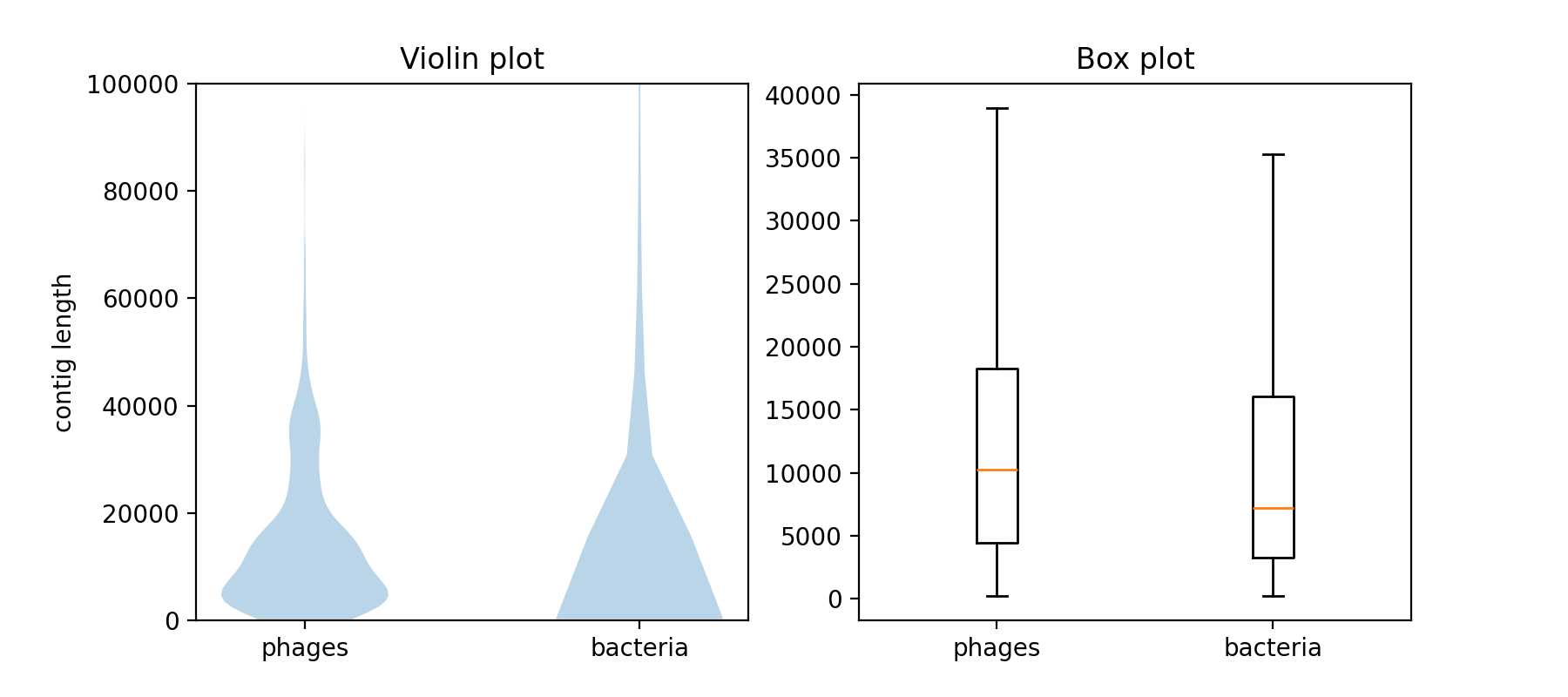
This assembly contains much longer, but also generally more contigs than the virome assembly. Use Matplotlib to visualize the distribution of the contig lengths. Use at least two plot types (e.g. histogram, violin plot, or boxplot) and adjust the plots to optimally visualize the differences in the contig length distributions. The bacterial assembly contains some very long fragments (outliers), try to find a way to deal with those.
First, you have to include Matplotlib into your virtual environment:
# activate the environment
$ source path/to/your/py3env/bin/activate

# install the packages we need
$ pip install matplotlib
Then you can write a plotting script. If you want to put multiple plots into the same figure, you can use the following lines of code:
import matplotlib as plt

# create a figure with two panels horizontally next to each other
fig, axs = plt.subplots(nrows=1, ncols=2, figsize=(9, 4))

# plot into the first (left) panel
axs[0].violinplot(list_of_datasets_to_plot)

# plot into the second (right) panel
axs[0].boxplot(list_of_datasets_to_plot)

# save the figure to a file
fig.savefig("filename.png")
python script for plotting differences in distributions
# This script takes 3 arguments. Run it:
# python your_script_file_name.py path/to/assembly1.fasta path/to/assembly2.fasta box_and_violin.png

import os, sys
from Bio import SeqIO
import matplotlib.pyplot as plt

def main():
    # take the first argument to the script as the filename to the bacterial assembly
    assembly1_filename = os.path.abspath(sys.argv[1])
    assert assembly1_filename.endswith(".fasta")

    # take the second argument to the script as the filename to the viral assembly
    assembly2_filename = os.path.abspath(sys.argv[2])
    assert assembly2_filename.endswith(".fasta")

    # set the filename of the output PNG file
    out_filename = os.path.abspath(sys.argv[3])
    assert out_filename.endswith(".png")

    # open the assembly files and get the lengths of each contig within one list
    with open(assembly1_filename) as handle:
        lengths_assembly1 = [len(record.seq) for record in SeqIO.parse(handle, "fasta")]

    with open(assembly2_filename) as handle:
        lengths_assembly2 = [len(record.seq) for record in SeqIO.parse(handle, "fasta")]

    # use pyplot to create a multi panel plot with 2 columns and 1 row. figsize is in inches...
    fig, axs = plt.subplots(nrows=1, ncols=2, figsize=(9, 4))

    # make violin plots for both lists of contig lengths
    axs[0].violinplot([lengths_assembly1, lengths_assembly2], showextrema=False)

    # add axis description and title, limit the y range for comparability
    axs[0].set_xticks([1,2], ["phages", "bacteria"])
    axs[0].set_ylim([0,100000])
    axs[0].set_title('Violin plot')

    # make box plots for both lists of contig lengths and add lables
    axs[1].boxplot([lengths_assembly1, lengths_assembly2], showfliers=False)
    axs[1].set_xticks([1,2], ["phages", "bacteria"])
    axs[1].set_title('Box plot')

    fig.savefig(out_filename, dpi=200)


if __name__ == "__main__":
    main()
Plot the difference between two assemblies
Plot the distribution of the lengths of both, the bacterial and the viral assemblies using Matplotlib. Choose at least 2 of the following:
- histogram
- boxplot
- violin plot
What are the strengths and weaknesses of your chosen visualizations? How do they compare in highlighting the differences in the length distributions of the two assemblies?
Key Points
matplotlib and pyplot provide multiple tools for the visualization of data points